- Home
- /
- Programming
- /
- Graphics
- /
- How to make a bar chart and assign the bar color based on the height o...
- RSS Feed
- Mark Topic as New
- Mark Topic as Read
- Float this Topic for Current User
- Bookmark
- Subscribe
- Mute
- Printer Friendly Page
- Mark as New
- Bookmark
- Subscribe
- Mute
- RSS Feed
- Permalink
- Report Inappropriate Content
Hi there,
I am trying to create a bar chart and think it should be a really really simple task ( you can do this probably in excel under 2 mins or in JMP under 2 mins) but seems like in SAS it is difficult.
So I have a simple data table which has two columns (vars): Location and Value; Location could be three different values and value is between 0 to 1; I am trying to use PROC GCHART to make a bar chart and the X axis is Location and Y axis is ValueT; in addition, I want to assign the bar chart color based on the ValueT; if valueT < 50, then bar should be red; if 50<= valueT<80, then yellow; and if valueT >= 80, then green, I also create a new variable called barcolor to assign the value as 1 2 3 to represent red yellow green . however, for my data table, sometimes it has values all over 80, some times values are all above 50, then if i use the pattern to assign the color to the bar, there will be a problem.
proc gchart data=test;
vbar Location / discrete sumvar=ValueT sum
subgroup=barcolor nolegend
ref=50 80 cref=(red green)
maxis=axis1 raxis=axis2;
pattern1 value=solid color=red;
pattern2 value=solid color=yellow;
pattern3 value=solid color=green;
axis1 label=("Location");
axis2 label=(angle=90 "ValueT")
order=(0.3to 1.0 by 0.1)
reflabel=("Action Limit" "Goal"); run; quit;
This code will not do the job when the data table does not have all three range of values; if you only have valueT below 50 and above 80, then the first one will be red but values over 80 of locations will show yellow (correct values should be Green).
Not sure I can do this in PROC GCHART, if not, are there any easy ways to do this? I searched online and maybe rangeattrmap could do it (need a simple example for my case; have read some examples under SAS docs but not easy to understand).
Accepted Solutions
- Mark as New
- Bookmark
- Subscribe
- Mute
- RSS Feed
- Permalink
- Report Inappropriate Content
I am sure there is a way using GCHART, but I will let other address that solution.
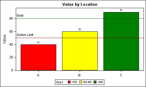
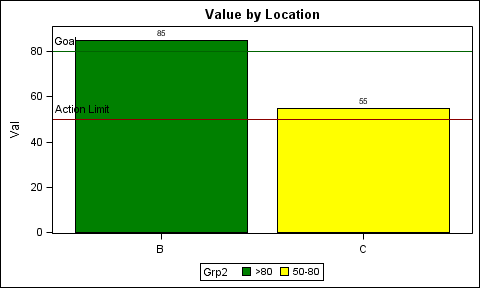
With SAS 9.3, you can use the SGPLOT procedure with Discrete Attributes Map to get the result you want. The colors are determined by the value of the group variable, not by its position in the data. This feature is designed for just this situation. The Discrete Attr Map is like a format, where you can specify the colors to be used by the VALUE of the group variable.
The first graph uses Value x Loc and Grp1. The second uses Val x Loc and Grp2. Note, in second case, the missing value of 'A" is removed. The order of the data is different, but the colors are assigned by the value of the group variable. The order of the color swatches in the legend are based on data order of the values, but you can order the legend alphabetically.
Program attached below.


data bar;
length Grp1 Grp2 $8;
input Loc $ Value Val;
if value < 50 then Grp1="<50";
else if value < 80 then Grp1="50-80";
else Grp1=">80";
if val < 50 then Grp2="<50";
else if val < 80 then Grp2="50-80";
else Grp2=">80";
datalines;
A 40 .
B 60 85
C 90 55
;
run;
data attrmap;
length value FillColor LineColor $8;
Id='A'; Value="<50"; FillColor='Red'; LineColor='Black'; output;
Id='A'; Value="50-80"; FillColor='Yellow'; LineColor='Black'; output;
Id='A'; Value=">80"; FillColor='Green'; LineColor='Black'; output;
run;
proc print;run;
ods graphics / reset width=5in height=3in imagename='BarAttrMap1_93';
title 'Value by Location';
proc sgplot data=bar dattrmap=attrmap;
vbar loc / response=value group=grp1 datalabel nostatlabel attrid=A ;
refline 50 / lineattrs=(color=darkred) label='Action Limit' labelloc=inside labelpos=min;
refline 80 / lineattrs=(color=darkgreen) label='Goal' labelloc=inside labelpos=min;
xaxis display=(nolabel);
run;
ods graphics / reset width=5in height=3in imagename='BarAttrMap2_93';
title 'Value by Location';
proc sgplot data=bar(where=(val ne .)) dattrmap=attrmap;
vbar loc / response=val group=grp2 datalabel nostatlabel attrid=A;
refline 50 / lineattrs=(color=darkred) label='Action Limit' labelloc=inside labelpos=min;
refline 80 / lineattrs=(color=darkgreen) label='Goal' labelloc=inside labelpos=min;
xaxis display=(nolabel);
run;
- Mark as New
- Bookmark
- Subscribe
- Mute
- RSS Feed
- Permalink
- Report Inappropriate Content
What version of SAS do you have?
- Mark as New
- Bookmark
- Subscribe
- Mute
- RSS Feed
- Permalink
- Report Inappropriate Content
Hi Dan,
I beilieve I have 9.3 or 9.4 ( I am using SAS EG 5.1).
Tao
- Mark as New
- Bookmark
- Subscribe
- Mute
- RSS Feed
- Permalink
- Report Inappropriate Content
If you are happy with manual edits, which is what Excel does, go to the graphics catalog where the output resides. If you didn't specify GOUT in Proc Gchart then work.gseg. Find the version you want, right click and select edit. You can can change colors, patterns, add text and a variety of other properties of graphics objects.
- Mark as New
- Bookmark
- Subscribe
- Mute
- RSS Feed
- Permalink
- Report Inappropriate Content
Hi Ballardw,
Thank you for your advice. The problem is I am gonna schedule the code on the server side so I have to make evereything in the program. And intuitively, I thought this should be a very straight forward question and not sure why the SAS graph is so hard to make it happen.
Tao
- Mark as New
- Bookmark
- Subscribe
- Mute
- RSS Feed
- Permalink
- Report Inappropriate Content
I am sure there is a way using GCHART, but I will let other address that solution.
With SAS 9.3, you can use the SGPLOT procedure with Discrete Attributes Map to get the result you want. The colors are determined by the value of the group variable, not by its position in the data. This feature is designed for just this situation. The Discrete Attr Map is like a format, where you can specify the colors to be used by the VALUE of the group variable.
The first graph uses Value x Loc and Grp1. The second uses Val x Loc and Grp2. Note, in second case, the missing value of 'A" is removed. The order of the data is different, but the colors are assigned by the value of the group variable. The order of the color swatches in the legend are based on data order of the values, but you can order the legend alphabetically.
Program attached below.


data bar;
length Grp1 Grp2 $8;
input Loc $ Value Val;
if value < 50 then Grp1="<50";
else if value < 80 then Grp1="50-80";
else Grp1=">80";
if val < 50 then Grp2="<50";
else if val < 80 then Grp2="50-80";
else Grp2=">80";
datalines;
A 40 .
B 60 85
C 90 55
;
run;
data attrmap;
length value FillColor LineColor $8;
Id='A'; Value="<50"; FillColor='Red'; LineColor='Black'; output;
Id='A'; Value="50-80"; FillColor='Yellow'; LineColor='Black'; output;
Id='A'; Value=">80"; FillColor='Green'; LineColor='Black'; output;
run;
proc print;run;
ods graphics / reset width=5in height=3in imagename='BarAttrMap1_93';
title 'Value by Location';
proc sgplot data=bar dattrmap=attrmap;
vbar loc / response=value group=grp1 datalabel nostatlabel attrid=A ;
refline 50 / lineattrs=(color=darkred) label='Action Limit' labelloc=inside labelpos=min;
refline 80 / lineattrs=(color=darkgreen) label='Goal' labelloc=inside labelpos=min;
xaxis display=(nolabel);
run;
ods graphics / reset width=5in height=3in imagename='BarAttrMap2_93';
title 'Value by Location';
proc sgplot data=bar(where=(val ne .)) dattrmap=attrmap;
vbar loc / response=val group=grp2 datalabel nostatlabel attrid=A;
refline 50 / lineattrs=(color=darkred) label='Action Limit' labelloc=inside labelpos=min;
refline 80 / lineattrs=(color=darkgreen) label='Goal' labelloc=inside labelpos=min;
xaxis display=(nolabel);
run;
- Mark as New
- Bookmark
- Subscribe
- Mute
- RSS Feed
- Permalink
- Report Inappropriate Content
Hi Sanjay,
Thank you so much for your help. I think this is exactly what I am trying to do. I have used SAS for several years but pretty new to the graphic related procs/features. Sometime it is little difficult for me to follow the SAS Support docs about different options etc. For exmple, you can create a Bar chart in proc gchart, or in proc sgplot, or even proc sgrender and I cannot tell in which situations I should use which proc.
Tao
- Mark as New
- Bookmark
- Subscribe
- Mute
- RSS Feed
- Permalink
- Report Inappropriate Content
In most cases SGPLOT is your best bet, and can handle 95% of the cases. SGPANEL for class panels. For complex (multi-cell) graphs, use GTL. I suggest you subscribe to the Graphically Speaking Blog for new ideas, tips and suggestions every week.
- Mark as New
- Bookmark
- Subscribe
- Mute
- RSS Feed
- Permalink
- Report Inappropriate Content
See blog article: Consistent Group Colors by Value - Graphically Speaking
Catch up on SAS Innovate 2026
Dive into keynotes, announcements and breakthroughs on demand.
Explore Now →Learn how use the CAT functions in SAS to join values from multiple variables into a single value.
Find more tutorials on the SAS Users YouTube channel.
SAS Training: Just a Click Away
Ready to level-up your skills? Choose your own adventure.


