- Home
- /
- Programming
- /
- Graphics
- /
- Help with legend
- RSS Feed
- Mark Topic as New
- Mark Topic as Read
- Float this Topic for Current User
- Bookmark
- Subscribe
- Mute
- Printer Friendly Page

- Mark as New
- Bookmark
- Subscribe
- Mute
- RSS Feed
- Permalink
- Report Inappropriate Content
If I fill some area on a line graph (that is using annotate dataset, I create a box in some area of the graph and color the box with say blue ).
Now how do I create a legend value of this color?? (the line graph will already be having a legend value associated with it for say 'amount' variable or any statistic variable.)... so how do I add the above color as a legend value to the existing default legend..???
Accepted Solutions

- Mark as New
- Bookmark
- Subscribe
- Mute
- RSS Feed
- Permalink
- Report Inappropriate Content
In that case, you could use the '1' coordinate system (such that you can specify x/y coordinates in the range of 0-100% of the area inside the axes). Here is the code that draws the orange area that way:
hsys='3'; when='b';
function = 'move'; xsys='2'; x=2008; ysys='1'; y=0; output;
function="bar"; xsys='1'; x=100; ysys='1'; y=100;
color="orange"; line=1; style="solid"; output;
- Mark as New
- Bookmark
- Subscribe
- Mute
- RSS Feed
- Permalink
- Report Inappropriate Content
Do we have any experts to answer this question? Any suggestions will be highly appreciative...![]()

- Mark as New
- Bookmark
- Subscribe
- Mute
- RSS Feed
- Permalink
- Report Inappropriate Content
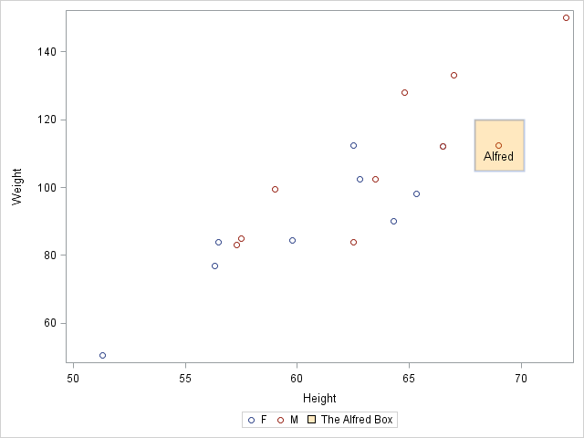
Here is how you can do it using the Graph Template Language (GTL) in SAS 9.3:
proc template;
define statgraph plot;
begingraph / drawspace=datavalue;
legenditem type=fill name="box" / label="The Alfred Box" fillattrs=(color=orange transparency=0.75);
layout overlay;
  scatterplot y=weight x=height / group=sex name="scatter";
  drawrectangle x=69 y=112.5 width=10 height=15 /
               display=all fillattrs=(color=orange)
               transparency=0.75;
  drawtext "Alfred" / x=69 y=112  anchor=top;
  discretelegend "scatter" "box";
endlayout;
endgraph;
end;
run;

proc sgrender data=sashelp.class template=plot; run;
- Mark as New
- Bookmark
- Subscribe
- Mute
- RSS Feed
- Permalink
- Report Inappropriate Content
Thanks DanH for your reply and providing a solution.
I am actually using SAS9.2. Running your code gave error at drawspace and legenditem............
Still I tried running the below simple proc template via EG to check step by step.. but got error:
ERROR: Insufficient authorization to access ...path../SASApp/SGRender1.png.
proc template;
define statgraph histogram;
begingraph;
layout overlay;
histogram weight;
endlayout;
endgraph;
end;
run;
ods graphics / width=450px;
ods listing;
proc sgrender data=sashelp.class
template=histogram;
run;
Then I tried running same via unix prompt and got error:
ERROR: The connection to the X display server could not be made....
But when running normal gplot and gchart procedures its not giving X display error....
- Mark as New
- Bookmark
- Subscribe
- Mute
- RSS Feed
- Permalink
- Report Inappropriate Content
Do you have an X-server running somewhere that you could set your 'DISPLAY' to?
(Maybe an XMing or Hummingbird eXceed X-server running somewhere?)
Such as: export DISPLAY=somemachine.foo.unx:0.0
In the past, SAS/Graph running on Unix needed an X-display to query what fonts were available.
After SAS version 9.2, I don't think SAS/Graph needs an X-display anymore, but maybe the ODS Graphics (such as proc sgrender) need it(?) - I'm not 100% sure on that one, but it's probably worth a try.
- Mark as New
- Bookmark
- Subscribe
- Mute
- RSS Feed
- Permalink
- Report Inappropriate Content
ODS Graphics does not need a display to run. When you say, "via unix prompt", are you running in batch, or with -nodms?
- Mark as New
- Bookmark
- Subscribe
- Mute
- RSS Feed
- Permalink
- Report Inappropriate Content
On unix prompt ; I just type > sas program_name.sas
But when I run any other sas program that has GPLOT & GCHART (via unix prompt or EG), it runs fine without any issues.
Before my previous reply , I had tried export display=host:port but that wasn't working...
- Mark as New
- Bookmark
- Subscribe
- Mute
- RSS Feed
- Permalink
- Report Inappropriate Content
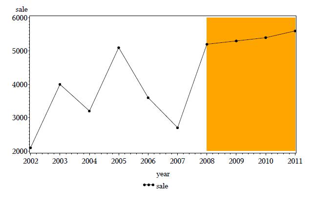
Below is the code that I can run in SAS9.2 and get the output. Is it possible to do some changes /addition to this code and get a legend displayed for the orange color in the graph.
I mean there must be some trick to fool SAS.. ![]()
data carea;
LENGTH FUNCTION $8 STYLE $8 COLOR $8;
retain xsys ysys "2" hsys "3" when "b";
function = 'move'; x=2008; y=2000; output;
function="bar"; x=2011; y=6000; color="orange"; line=1; style="simplex"; output;
run;
symbol v=dot i=join;
legend1 label=none;
proc gplot data=sales;
plot (sale) * year/ legend=legend1 annotate=carea;
run;
quit;
- Mark as New
- Bookmark
- Subscribe
- Mute
- RSS Feed
- Permalink
- Report Inappropriate Content
Here is the output :
- Mark as New
- Bookmark
- Subscribe
- Mute
- RSS Feed
- Permalink
- Report Inappropriate Content
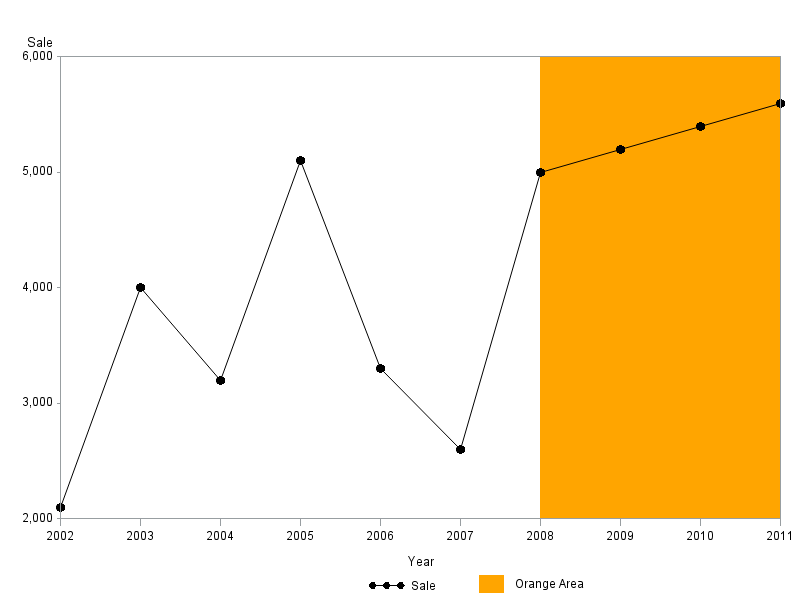
The following example shows how to manually annotate a legend for the orange color:
%let name=anno_legend;
filename odsout '.';
data sales;
format Sale comma10.0;
input Year Sale;
datalines;
2002 2100
2003 4000
2004 3200
2005 5100
2006 3300
2007 2600
2008 5000
2009 5200
2010 5400
2011 5600
;
run;
data color_area;
LENGTH FUNCTION $8 STYLE $8 COLOR $8;
xsys='2'; ysys='2'; hsys='3'; when='b';
function = 'move'; x=2008; y=2000; output;
function="bar"; x=2011; y=6000;
color="orange"; line=1; style="solid"; output;
/* Draw a custom legend with annotate */
xsys='3'; ysys='3'; hsys='3'; when='a';
function = 'move'; x=60; y=1; output;
function="bar"; x=x+3; y=y+3;
color="orange"; line=1; style="solid"; output;
function="label"; color='black'; position='6'; x=64.5; y=3;
text="Orange Area"; output;
run;
goptions device=png;
ODS LISTING CLOSE;
ODS HTML path=odsout body="&name..htm" style=htmlblue;
symbol1 value=dot height=1.5 interpol=join color=black;
legend1 label=none;
axis1 minor=none offset=(0,0);
axis2 minor=none offset=(0,0);
proc gplot data=sales;
plot sale*year=1 /
legend=legend1 annotate=color_area
vaxis=axis1 haxis=axis2
des='' name="&name";
run;
quit;
ODS HTML CLOSE;
ODS LISTING;
- Mark as New
- Bookmark
- Subscribe
- Mute
- RSS Feed
- Permalink
- Report Inappropriate Content
Here is the output:
- Mark as New
- Bookmark
- Subscribe
- Mute
- RSS Feed
- Permalink
- Report Inappropriate Content
Thanks Robert ! This works...
The only thing is if footnotes are added or if the height of graph area changes, then adjustment will have to be made to the co-ordinates of this legend...right? Other than that this looks great!!
One small question..
In above example to draw a bar , we start from x=2008, y=2000 till x1=2011 , y1=6000.
Suppose if the data keeps on changing then we dont know what exactly will be thevalue for y,x1,y1.
But we know only x (i.e., 2008...from where the fill area should start ) and that starting from 2008 till the maximum point on X-axis all of the area needs to be filled with a color. Is it possible to do something like .... Move to point 2008 on X-axis; then draw a straight line till the top of the plot area; then fill all of the area on the right side of this straight line?
- Mark as New
- Bookmark
- Subscribe
- Mute
- RSS Feed
- Permalink
- Report Inappropriate Content
In that case, you could use the '1' coordinate system (such that you can specify x/y coordinates in the range of 0-100% of the area inside the axes). Here is the code that draws the orange area that way:
hsys='3'; when='b';
function = 'move'; xsys='2'; x=2008; ysys='1'; y=0; output;
function="bar"; xsys='1'; x=100; ysys='1'; y=100;
color="orange"; line=1; style="solid"; output;
- Mark as New
- Bookmark
- Subscribe
- Mute
- RSS Feed
- Permalink
- Report Inappropriate Content
Excellent! this works.... Thanks Robert, u r great!!
.jpg")
Catch up on SAS Innovate 2026
Nearly 200 sessions are now available on demand in the Innovate Hub.
Watch Now →Learn how use the CAT functions in SAS to join values from multiple variables into a single value.

Find more tutorials on the SAS Users YouTube channel.
SAS Training: Just a Click Away
Ready to level-up your skills? Choose your own adventure.
-
13 replies
-
10-13-2012 01:49 AM
-
7468 views
-
2 likes
-
3 in conversation
-
