- Home
- /
- Programming
- /
- Graphics
- /
- GTL Boxplot axis scaled ignoring outliers
- RSS Feed
- Mark Topic as New
- Mark Topic as Read
- Float this Topic for Current User
- Bookmark
- Subscribe
- Mute
- Printer Friendly Page
- Mark as New
- Bookmark
- Subscribe
- Mute
- RSS Feed
- Permalink
- Report Inappropriate Content
Hi,
I'm using 9.3 GTL to make a box plot that does NOT display outliers. Is there a way to have the axis scaling algorithm also ignore outliers? I want to include outliers in calculation of the mean and percentiles, I just don't want to display them, and I don't want outliers to cause an extremely long axis.
The docs note that the DISPLAY option I used below does not impact the axis at all. Only approaches I've come up with would be to compute the summary statistics myself and then use BOXPLOTPARM, or to come up with my own algorithm for scaling the y-axis.
Sample code showing y-axis scaled including one outlier, smushing the boxes:
ods path (prepend) work.mytpl;

proc template;
  define statgraph MyBoxPlot;
    begingraph;
      layout overlay;
        boxplot x=country y=actual /
          display=(caps fill mean median /*outliers*/)
        ;
      endlayout;
    endgraph;
  end;
run;

data prdsale;
  set sashelp.prdsale;
  if _n_=1 then actual=3000;
run;

proc sgrender data=prdsale template="MyBoxPlot";
run;
Thanks,
--Q.
Register now at https://www.basug.org/events.
Accepted Solutions
- Mark as New
- Bookmark
- Subscribe
- Mute
- RSS Feed
- Permalink
- Report Inappropriate Content
Here is one way, though it will need a bit of coding.
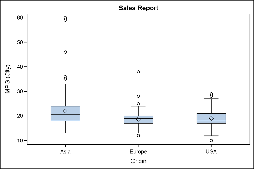
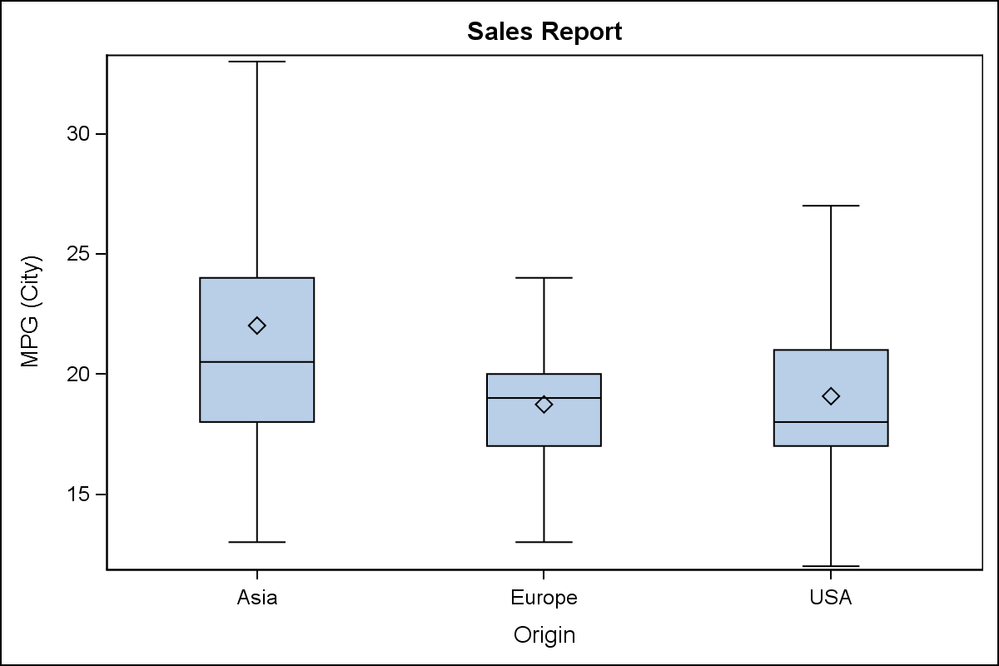
Run SGPLOT to create the regular box plot of your data with categories. User ODS OUTPUT SGPLOT=box; statement to get the box plot data in the output data set "Box". This data is in the form suitable to draw the box plot and has a variable called "box_mpg_city_x_origin__st" that is the statistic and "box_mpg_city_x_origin___y" that is the Y value of the statistic. MIN and MAX provide the values for the whiskers.
Extract this data, and place the global min and max values in macro variables. Then rerun the same SGPLOT again, and now specify the NOOUTLIERS option and set YAXIS MIN=&min and MAX=&Max.
ods output sgplot=box(rename=(box_mpg_city_x_origin__st=stat box_mpg_city_x_origin___y=value));
ods graphics / reset width=6in height=4in imagename='Box_With_Outliers';
proc sgplot data=sashelp.cars;
vbox mpg_city / category=origin;
run;
data box2;
retain min 1e6 max -1e6;
keep value stat;
set box (where=(stat in ('MIN', 'MAX'))) end=last;
if stat = 'MIN' then min=min(min, value);
if stat = 'MAX' then max=max(max, value);
if last then do;
call symput ("MIN", min);
call symput ("MAX", max);
end;
run;
ods graphics / reset width=6in height=4in imagename='Box_Without_Outliers';
proc sgplot data=sashelp.cars;
vbox mpg_city / category=origin nooutliers;
yaxis min=&min max=&max;
run;
I do have some concern with this. Not being a Statistician, I don't know if this will provide an incorrect presentation to a reader. At least the Y axis indicates presence of outliers, even if they are suppressed. Maybe you can just make them more transparent.


- Mark as New
- Bookmark
- Subscribe
- Mute
- RSS Feed
- Permalink
- Report Inappropriate Content
Hi Quentin,
Have you tried the outlierattrs option? You could try outlierattrs=(size=0) and see if that gets rid of the outliers. I usually use a similar option to not display markers.
Thanks.
- Mark as New
- Bookmark
- Subscribe
- Mute
- RSS Feed
- Permalink
- Report Inappropriate Content
Thanks @djrisks.
OUTLIERATTRS(size=0) works to hide the outliers, achieving the same as the DISPLAY option in my posted code. But the axis is still scaled to include outliers. The outlier value of 3000 forces the y-axis to go up to 3000, instead of the desired ~1000.
-Q.
Register now at https://www.basug.org/events.
- Mark as New
- Bookmark
- Subscribe
- Mute
- RSS Feed
- Permalink
- Report Inappropriate Content
Oh, I understand now @Quentin
The solution I can think of at the moment is not elegant, it involves calculating the maximum and minimum values of the dataset without the outliers and then setting those minimum and maximum values as dynamic or numeric macro variables, and then using those min and max values in the yaxis options.
Hopefully, there is a simpler solution out there though.
Thanks.
- Mark as New
- Bookmark
- Subscribe
- Mute
- RSS Feed
- Permalink
- Report Inappropriate Content
If you know a maximum value you want to set as an upper bound for the box plot you could make that a dynamic parameter of your GTL code
define statgraph MyBoxPlot;
dynamic ymax;
begingraph;
and use the VIEWMAX = YMAX in a Yaxisopts statement.
proc sgrender data=prdsale template="MyBoxPlot";
ymax=1000;
run;
- Mark as New
- Bookmark
- Subscribe
- Mute
- RSS Feed
- Permalink
- Report Inappropriate Content
Thanks @ballardw. The bummer is I don't know the maximum value in advance. (Writing a box plot stored process that will be used for various stuff). So if I need to monkey with viewmax or the axis, I would need to compute the upper/lower whisker for each group, and then find the max/min whisker in the chart, and set viewmax/viewmin after that. Which is doable, but was hoping there would be something automagical.
I haven't used GPLOT in years, but my memory is you had to do something extra to ask for outliers to be displayed (which I didn't like), but if you didn't ask for outliers, the axis was scaled to fit the box-and-whiskers (whcih I did like).
Register now at https://www.basug.org/events.
- Mark as New
- Bookmark
- Subscribe
- Mute
- RSS Feed
- Permalink
- Report Inappropriate Content
You may have to go down the route of calculating the values yourself. If you did decide to do that, then once you've found the min/max whisker in the chart, you can set those up as macro variables and then base viewmin and viewmax on those values. That way the code will be reusable.
- Mark as New
- Bookmark
- Subscribe
- Mute
- RSS Feed
- Permalink
- Report Inappropriate Content
Here is one way, though it will need a bit of coding.
Run SGPLOT to create the regular box plot of your data with categories. User ODS OUTPUT SGPLOT=box; statement to get the box plot data in the output data set "Box". This data is in the form suitable to draw the box plot and has a variable called "box_mpg_city_x_origin__st" that is the statistic and "box_mpg_city_x_origin___y" that is the Y value of the statistic. MIN and MAX provide the values for the whiskers.
Extract this data, and place the global min and max values in macro variables. Then rerun the same SGPLOT again, and now specify the NOOUTLIERS option and set YAXIS MIN=&min and MAX=&Max.
ods output sgplot=box(rename=(box_mpg_city_x_origin__st=stat box_mpg_city_x_origin___y=value));
ods graphics / reset width=6in height=4in imagename='Box_With_Outliers';
proc sgplot data=sashelp.cars;
vbox mpg_city / category=origin;
run;
data box2;
retain min 1e6 max -1e6;
keep value stat;
set box (where=(stat in ('MIN', 'MAX'))) end=last;
if stat = 'MIN' then min=min(min, value);
if stat = 'MAX' then max=max(max, value);
if last then do;
call symput ("MIN", min);
call symput ("MAX", max);
end;
run;
ods graphics / reset width=6in height=4in imagename='Box_Without_Outliers';
proc sgplot data=sashelp.cars;
vbox mpg_city / category=origin nooutliers;
yaxis min=&min max=&max;
run;
I do have some concern with this. Not being a Statistician, I don't know if this will provide an incorrect presentation to a reader. At least the Y axis indicates presence of outliers, even if they are suppressed. Maybe you can just make them more transparent.


- Mark as New
- Bookmark
- Subscribe
- Mute
- RSS Feed
- Permalink
- Report Inappropriate Content
Thanks @Jay54, that's a helpful approach. Have to admit, I had never thought to use ODS OUTPUT with SGPLOT. Good to know that it makes data tables available. I can imagine quite a few settings that will come in handy.
That said, my next question (tomorrow or next week), will be about trying to find ways to make SGRENDER run more quickly when generating a boxplot with thousands of data points behind it. As I have it coded currently, the time costs of running an extra SGPLOT step are probably too high (in stored process setting).
The other option I'm considering is to just go ahead and convert to BOXPLOTPARM, using something like %BoxPlotParm (http://support.sas.com/documentation/cdl/en/grstatgraph/65377/HTML/default/viewer.htm#p14r3dprwc36p7... I think if I do that, I could then choose to include/exclude outliers in the data, and then use the default axes. And I think BoxPlotParm might run faster than BOXPLOT, since it is starting with a much-smaller precalculated dataset.
That said, I would vote for changing this in the future if feasible. If I'm making a chart that does not display outliers, I don't see a benefit to including non-displayed outlier values in the axis scaling algorithm.
Register now at https://www.basug.org/events.
- Mark as New
- Bookmark
- Subscribe
- Mute
- RSS Feed
- Permalink
- Report Inappropriate Content
One variation of the solution is suggested by Prashant and removes the OUTLIER stat values from the data after the first pass. Then, use this modified data directly using BoxPlotParm. However, a VBOXPARM is not available in SGPLOT, you you would have to use the GTL version with BoxPlotParm in the second pass. That could address your concern about the performance for large data. You might as well use the GTL program for the first pass too.
I just tried this method. Make sure to remove all observations with STAT of OUTLIER, FAROUTLIER, DATAMIN, DATAMAX and blank (missing).
We will certainly entertain the possibility of adding an option to the box plot to retain the data extents of only the items being displayed. This should be relatively simple, and will avoid a second pass. If this is of interest to you, you could pass this on to Tech Support as a request for new functionality.
- Mark as New
- Bookmark
- Subscribe
- Mute
- RSS Feed
- Permalink
- Report Inappropriate Content
Although it is 18 months after the original question, I would like this feature added to the options for the vbox statement in SGPLOT. I do appreciate the workaround, though.
Catch up on SAS Innovate 2026
Dive into keynotes, announcements and breakthroughs on demand.
Explore Now →Learn how use the CAT functions in SAS to join values from multiple variables into a single value.
Find more tutorials on the SAS Users YouTube channel.
SAS Training: Just a Click Away
Ready to level-up your skills? Choose your own adventure.


