- Home
- /
- Programming
- /
- Graphics
- /
- Dual axis bar chart with different categories
- RSS Feed
- Mark Topic as New
- Mark Topic as Read
- Float this Topic for Current User
- Bookmark
- Subscribe
- Mute
- Printer Friendly Page
- Mark as New
- Bookmark
- Subscribe
- Mute
- RSS Feed
- Permalink
- Report Inappropriate Content
I would like to know how I can create a dual axis bar chart with different categories using SAS commands. I am attaching an image that is an example of what I need to do. The example is very accurate, except that I do not need the line graph. Since I am using private data, I cannot upload the data set or my commands. I would truly appreciate any help.
Accepted Solutions
- Mark as New
- Bookmark
- Subscribe
- Mute
- RSS Feed
- Permalink
- Report Inappropriate Content
See new Graphically Speaking article inspired by your question.
- Mark as New
- Bookmark
- Subscribe
- Mute
- RSS Feed
- Permalink
- Report Inappropriate Content
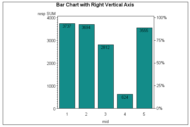
Did you have a look at Sample 41975: Annotate a right vertical axis on PROC GCHART output, it should help you.
This is the output of the sample.
And you can always use @GraphGuy page Robert Allison's SAS/Graph Examples! which has more examples that you can think of (or Graphics Samples Output Gallery).
Hope that helps.
Cheers,
Damo
- Mark as New
- Bookmark
- Subscribe
- Mute
- RSS Feed
- Permalink
- Report Inappropriate Content
@priscilabaddouh wrote:
I cannot upload the data set or my commands.
The data I agree can be sensitive. If you have sufficient information in program code to violate any sensitivity rules I would be very skeptical though. Or change the name of your data set from sensitivename to genericname (HAVE is frequently used on this forum for any existing data set) and similar for variable names.
- Mark as New
- Bookmark
- Subscribe
- Mute
- RSS Feed
- Permalink
- Report Inappropriate Content
This should work for you:
proc sgplot data=sashelp.class;
yaxis refticks=(label values);
vbar age / response=weight stat=sum group=sex;
run;
Thanks!
Dan
- Mark as New
- Bookmark
- Subscribe
- Mute
- RSS Feed
- Permalink
- Report Inappropriate Content
See new Graphically Speaking article inspired by your question.
- Mark as New
- Bookmark
- Subscribe
- Mute
- RSS Feed
- Permalink
- Report Inappropriate Content
Thank you so much. I could not be more thankful. Have an amazing day!
Catch up on SAS Innovate 2026
Nearly 200 sessions are now available on demand with the SAS Innovate Digital Pass.
Explore Now →Learn how use the CAT functions in SAS to join values from multiple variables into a single value.
Find more tutorials on the SAS Users YouTube channel.
SAS Training: Just a Click Away
Ready to level-up your skills? Choose your own adventure.


