- Home
- /
- Programming
- /
- Graphics
- /
- Categorical scatterplots similar to PRISM?
- RSS Feed
- Mark Topic as New
- Mark Topic as Read
- Float this Topic for Current User
- Bookmark
- Subscribe
- Mute
- Printer Friendly Page

- Mark as New
- Bookmark
- Subscribe
- Mute
- RSS Feed
- Permalink
- Report Inappropriate Content
The title says it all, I'm trying to generate a scatterplot similar what PRISM can do. Has anyone tried to do something similar in SAS?

http://i.stack.imgur.com/z53zB.gif
Trying a categorical x-axis only creates a column of dots with the corresponding values.
proc sgplot data=sashelp.class;
scatter x=sex y = height
/MARKERATTRS =(symbol=circlefilled);
run;
I appreciate your feedback.

- Mark as New
- Bookmark
- Subscribe
- Mute
- RSS Feed
- Permalink
- Report Inappropriate Content
You may have to explain what that graph represents and the pieces. No legend makes it very hard to guess. It looks like it might be a scatter plot overlayed on a box plot but the content isn't very obvious without much more information.
Include data used to make your example as we have no clue what your data structure would be and we can't even make a test data set to try to match your output.

- Mark as New
- Bookmark
- Subscribe
- Mute
- RSS Feed
- Permalink
- Report Inappropriate Content
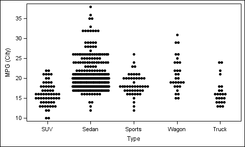
JITTER is supported at SAS 9.4. Jitter kicks in when the data is very dense. But it may not kick in for sashelp.class.
proc sgplot data=sashelp.cars(where=(type ne 'Hybrid'));
scatter x=type y=mpg_city / jitter
MARKERATTRS=(symbol=circlefilled);
run;
We are considering other types of jitter and options. Please feel free to provide your suggestions.
.jpg")
Catch up on SAS Innovate 2026
Nearly 200 sessions are now available on demand with the SAS Innovate Digital Pass.
Explore Now →Learn how use the CAT functions in SAS to join values from multiple variables into a single value.

Find more tutorials on the SAS Users YouTube channel.
SAS Training: Just a Click Away
Ready to level-up your skills? Choose your own adventure.
-
2 replies
-
06-12-2014 11:32 AM
-
3494 views
-
0 likes
-
3 in conversation
-
