- Home
- /
- Programming
- /
- Graphics
- /
- Re: Box Plots
- RSS Feed
- Mark Topic as New
- Mark Topic as Read
- Float this Topic for Current User
- Bookmark
- Subscribe
- Mute
- Printer Friendly Page
- Mark as New
- Bookmark
- Subscribe
- Mute
- RSS Feed
- Permalink
- Report Inappropriate Content
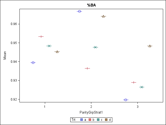
I have output my interactive means from the glimmix procedure of SAS and am trying to make box plots from these means. Please see the attached. I don't understand why they aren't coming through as box plots. See my code below. I am wanting to look and see if there are any outliers in this data set and thus, am wanting to visualize with box plots. Any suggestions?
Thanks!
Proc SGPlot data=Means;
Vbox Mu/ Category=ParityGrpStrat1 Group=Trt;
Run;
Accepted Solutions
- Mark as New
- Bookmark
- Subscribe
- Mute
- RSS Feed
- Permalink
- Report Inappropriate Content
Given your data, you are successfully plotting the means. You see the mean and the median, which are the same. That is all you provided to plot.
- Mark as New
- Bookmark
- Subscribe
- Mute
- RSS Feed
- Permalink
- Report Inappropriate Content
Try it once without group= and see if that is more what you had in mind. I have never tried group= and category= together. Do you have any variability within those groups?
- Mark as New
- Bookmark
- Subscribe
- Mute
- RSS Feed
- Permalink
- Report Inappropriate Content
Thanks. This allowed me to see the box plots better for each "grouping" if you will. I plotted with the raw data and was successful. Just not sure why it wouldn't work the same with these means.
Thanks for your help!
- Mark as New
- Bookmark
- Subscribe
- Mute
- RSS Feed
- Permalink
- Report Inappropriate Content
Hi:
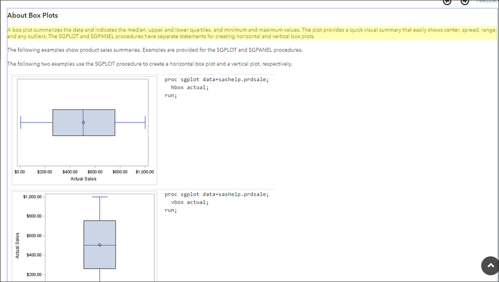
It was my understanding that the Box plot was doing the summarizing for you. For example, in the documentation about box plots:
SASHELP.PRDSALE is NOT pre-summarized. The VBOX statement causes the data to be summarized and the mean calculated.
Or, if I do this:
proc sgplot data=sashelp.iris;
  vbox sepallength / group=species;
run;
SASHELP.IRIS is not presummarized, the mean and outlier are shown based on the unsummarized data in the data set.
The things I might suggest are that you use your original dataset with the SGPLOT procedure step so that you see the distribution of your unsummarized data.
OR, PROC GLIMMIX has a PLOTS= option and will produce a Box plot using ODS GRAPHICS, so looking up the PLOTS= option might help you too.
Also, if you are just looking for outliers, PROC UNIVARIATE will show you the 5 highest and lowest (extreme obs) by default if you do this:
proc univariate data=sashelp.iris;
  var sepallength;
run;
cynthia
- Mark as New
- Bookmark
- Subscribe
- Mute
- RSS Feed
- Permalink
- Report Inappropriate Content
Thanks for your help. I was able to successfully plot with the raw data. I am still not sure though why I can't with the means.
Thanks again!
- Mark as New
- Bookmark
- Subscribe
- Mute
- RSS Feed
- Permalink
- Report Inappropriate Content
Given your data, you are successfully plotting the means. You see the mean and the median, which are the same. That is all you provided to plot.
Catch up on SAS Innovate 2026
Nearly 200 sessions are now available on demand with the SAS Innovate Digital Pass.
Explore Now →Learn how use the CAT functions in SAS to join values from multiple variables into a single value.
Find more tutorials on the SAS Users YouTube channel.
SAS Training: Just a Click Away
Ready to level-up your skills? Choose your own adventure.


