- Home
- /
- Programming
- /
- Graphics
- /
- Add a y-axis break in SGPANEL
- RSS Feed
- Mark Topic as New
- Mark Topic as Read
- Float this Topic for Current User
- Bookmark
- Subscribe
- Mute
- Printer Friendly Page
- Mark as New
- Bookmark
- Subscribe
- Mute
- RSS Feed
- Permalink
- Report Inappropriate Content
Hi,
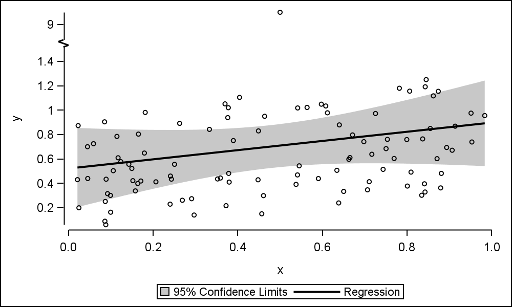
Does anyone know of a way to add a break in the Y-axis of a plot created with SGPANEL?
I'm essentially looking for an equivalent to the 'ranges' option in an axis statement in SGPLOT, or some workaround that produces a similar effect (see figure below for an example of a Y-axis break using the 'ranges' option in SGPLOT)

I'm running Enterprise Guide v7.15HF3. The plot I would like to apply this quite complex (4 panels stacked in a single column; the main display in each panel is a band plot, but with scatter and series overlaid). I would need the break to appear in the y-axis of each panel.
Thanks,
Stuart
- Mark as New
- Bookmark
- Subscribe
- Mute
- RSS Feed
- Permalink
- Report Inappropriate Content
Rowaxis statement has the options for modifying the y-axis in Proc Sgpanel:
Catch up on SAS Innovate 2026
Nearly 200 sessions are now available on demand with the SAS Innovate Digital Pass.
Explore Now →Learn how use the CAT functions in SAS to join values from multiple variables into a single value.
Find more tutorials on the SAS Users YouTube channel.
SAS Training: Just a Click Away
Ready to level-up your skills? Choose your own adventure.


