- Home
- /
- Programming
- /
- Programming
- /
- PROC GCHART - issue with the formating
- RSS Feed
- Mark Topic as New
- Mark Topic as Read
- Float this Topic for Current User
- Bookmark
- Subscribe
- Mute
- Printer Friendly Page
- Mark as New
- Bookmark
- Subscribe
- Mute
- RSS Feed
- Permalink
- Report Inappropriate Content
Hi,
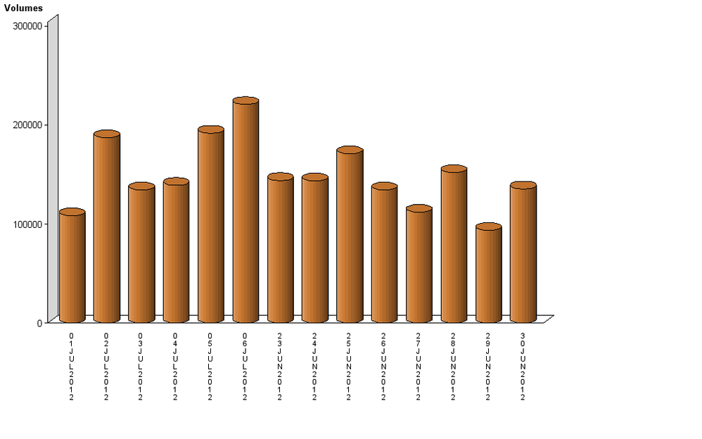
I am using PROC GCHART to draw a 3d Bar chart... sample snapshot is attached to the note
Issue is that the dates at the bottom of the chart doesn't look good... can someone please advice how to improve it..
Thanks in advance

- Mark as New
- Bookmark
- Subscribe
- Mute
- RSS Feed
- Permalink
- Report Inappropriate Content
anyone...?
- Mark as New
- Bookmark
- Subscribe
- Mute
- RSS Feed
- Permalink
- Report Inappropriate Content
please try as this
Proc Gchart data=Temp;
Vbar3d tempc/caxis=red cframe=green
ctext=blue width=10;
or
change the date format in the DATA set itself.
ALLU
- Mark as New
- Bookmark
- Subscribe
- Mute
- RSS Feed
- Permalink
- Report Inappropriate Content
TRY THIS.
Proc Gchart data=Temp;
Vbar3d tempc/caxis=red cframe=green
ctext=blue space=5 subgroup=zone ;
Run;
- Mark as New
- Bookmark
- Subscribe
- Mute
- RSS Feed
- Permalink
- Report Inappropriate Content
I would say also that you should specify what you mean by "doesn't look good". What don't you like and what would be your preferred change?
If the vertical is the problem that can be addressed with an AXIS statement and text options to angle the text.
Don't miss out on SAS Innovate - Register now for the FREE Livestream!
Can't make it to Vegas? No problem! Watch our general sessions LIVE or on-demand starting April 17th. Hear from SAS execs, best-selling author Adam Grant, Hot Ones host Sean Evans, top tech journalist Kara Swisher, AI expert Cassie Kozyrkov, and the mind-blowing dance crew iLuminate! Plus, get access to over 20 breakout sessions.
Learn how use the CAT functions in SAS to join values from multiple variables into a single value.
Find more tutorials on the SAS Users YouTube channel.
 Click image to register for webinar
Classroom Training Available!
Select SAS Training centers are offering in-person courses. View upcoming courses for:


