- Home
- /
- Programming
- /
- Programming
- /
- Re: How can I display the name of a series in the legend instead of th...
- RSS Feed
- Mark Topic as New
- Mark Topic as Read
- Float this Topic for Current User
- Bookmark
- Subscribe
- Mute
- Printer Friendly Page

- Mark as New
- Bookmark
- Subscribe
- Mute
- RSS Feed
- Permalink
- Report Inappropriate Content
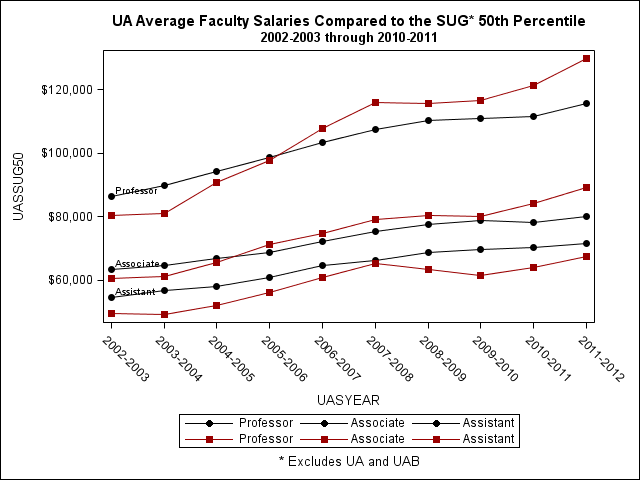
I am plotting the values for two series, peer salaries and UA average salaries by year and rank. I am using PROC SGPLOT and two series statements with the year as the x value and the salaries as the y value, then the rank is the group variable. I have SAS 9.2. I want the legend to simply show that the first series is the peer salary and the second is the UA average salary, not show the group (rank) values. Even using the legendlabel option, I can't seem to make this happen. My code and results are below. Suggestions are greatly appreciated!
proc sgplot data=faculty noautolegend;
where uasrank in ('1','2','3');
series x=uasyear y=uassug50/group=uasrank
markers
markerattrs=(symbol=circlefilled)
lineattrs=(color=black pattern=solid)
legendlabel="SUG 50th Percentile"
name="sug50" datalabel=label;
series x=uasyear y=uasuaavg/group=uasrank
markers
markerattrs=(symbol=squarefilled)
lineattrs=(color=CX990000 pattern=solid)
legendlabel="UA Average"
name="uaavg";
keylegend "sug50" "uaavg";
xaxis label='';
yaxis label='';
format uasrank $fac_rank. uasyear $year. uassug50 dollar12. uasuaavg dollar12.;
run;
Accepted Solutions
- Mark as New
- Bookmark
- Subscribe
- Mute
- RSS Feed
- Permalink
- Report Inappropriate Content
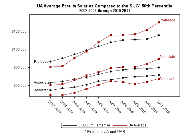
Several people from SAS helped me with this, and I appreciate all their work. It looks like, as I always suspect, that you can do most anything in SAS even if not in a totally direct way. Here is the answer that worked for me, given by Sanjay Matange:
data faculty;
set faculty;
a=.;
if _n_ = 1 then a=0;
run;
proc sgplot data=faculty noautolegend;
where uasrank in ('1','2','3');
series x=uasyear y=uassug50/group=uasrank
markers
markerattrs=(symbol=circlefilled)
lineattrs=(pattern=solid color=black)
curvelabel
curvelabelpos=start;
series x=uasyear y=uasuaavg/group=uasrank
markers
markerattrs=(symbol=squarefilled)
lineattrs=(pattern=solid color=CX990000)
curvelabel
curvelabelpos=end;
series x=uasyear y=a / lineattrs=graphdata1(color=black pattern=solid)
name='a' legendlabel="SUG 50th Percentile";
series x=uasyear y=a / lineattrs=graphdata2(color=CX990000 pattern=solid)
name='b' legendlabel="UA Average";
keylegend "a" "b";
xaxis label=' ';
yaxis label=' ' min=50000;;
format uasyear $year. uasrank $fac_rank. uassug50 dollar12. uasuaavg dollar12.;
run;

- Mark as New
- Bookmark
- Subscribe
- Mute
- RSS Feed
- Permalink
- Report Inappropriate Content
You could use two KEYLEGEND statements with different titles. If you specify the same location and position for both legends they will be correctly stacked. (hope this is not new to 9.3)
PG
- Mark as New
- Bookmark
- Subscribe
- Mute
- RSS Feed
- Permalink
- Report Inappropriate Content
Several people from SAS helped me with this, and I appreciate all their work. It looks like, as I always suspect, that you can do most anything in SAS even if not in a totally direct way. Here is the answer that worked for me, given by Sanjay Matange:
data faculty;
set faculty;
a=.;
if _n_ = 1 then a=0;
run;
proc sgplot data=faculty noautolegend;
where uasrank in ('1','2','3');
series x=uasyear y=uassug50/group=uasrank
markers
markerattrs=(symbol=circlefilled)
lineattrs=(pattern=solid color=black)
curvelabel
curvelabelpos=start;
series x=uasyear y=uasuaavg/group=uasrank
markers
markerattrs=(symbol=squarefilled)
lineattrs=(pattern=solid color=CX990000)
curvelabel
curvelabelpos=end;
series x=uasyear y=a / lineattrs=graphdata1(color=black pattern=solid)
name='a' legendlabel="SUG 50th Percentile";
series x=uasyear y=a / lineattrs=graphdata2(color=CX990000 pattern=solid)
name='b' legendlabel="UA Average";
keylegend "a" "b";
xaxis label=' ';
yaxis label=' ' min=50000;;
format uasyear $year. uasrank $fac_rank. uassug50 dollar12. uasuaavg dollar12.;
run;

Don't miss out on SAS Innovate - Register now for the FREE Livestream!
Can't make it to Vegas? No problem! Watch our general sessions LIVE or on-demand starting April 17th. Hear from SAS execs, best-selling author Adam Grant, Hot Ones host Sean Evans, top tech journalist Kara Swisher, AI expert Cassie Kozyrkov, and the mind-blowing dance crew iLuminate! Plus, get access to over 20 breakout sessions.
Learn how use the CAT functions in SAS to join values from multiple variables into a single value.

Find more tutorials on the SAS Users YouTube channel.
 Click image to register for webinar
Classroom Training Available!
Select SAS Training centers are offering in-person courses. View upcoming courses for:
-
2 replies
-
10-19-2012 01:08 PM
-
2678 views
-
0 likes
-
2 in conversation
-
