- Home
- /
- Programming
- /
- Programming
- /
- Re: Help with plot of GBARLINE
- RSS Feed
- Mark Topic as New
- Mark Topic as Read
- Float this Topic for Current User
- Bookmark
- Subscribe
- Mute
- Printer Friendly Page

- Mark as New
- Bookmark
- Subscribe
- Mute
- RSS Feed
- Permalink
- Report Inappropriate Content
Hello Experts,
Need your suggestions/help for the problem I am facing.
Here is the dataset, the code and the current output:
Dataset:
| Period | Amount | Change |
| 31/03/07 | 100 | 3.5 |
| 30/06/07 | 110 | 3 |
| 30/09/07 | 116 | 10 |
| 31/12/07 | 125 | 4 |
| 31/03/08 | 118 | 3.2 |
| 30/06/08 | 128 | 3 |
| 30/09/08 | 135 | 3.5 |
| 31/12/08 | 140 | 4 |
| 31/03/09 | 145 | 2 |
| 30/06/09 | 153 | 12 |
| 30/09/09 | 130 | 1.5 |
| 31/12/09 | 135 | 1 |
| 31/03/10 | 120 | 1.5 |
| 30/06/10 | 140 | 2 |
| 30/09/10 | 152 | 1 |
| 31/12/10 | 164 | 2 |
| 31/03/11 | 175 | 1.5 |
| 30/06/11 | 180 | 15 |
| 30/09/11 | 188 | 2 |
| 31/12/11 | 195 | 1.7 |
CODE:
/*****************************************************/
symbol1 value=dot height=0.25 interpol=join color=red;
axis1 minor=none label=(angle=90 "change") ;
axis3 minor=none label=("Year") ;
axis2 minor=none label=(angle=270 color=red "amount") value=(color=red);
proc gbarline data=GBARLIN1;
bar period / discrete type=mean sumvar=change raxis=axis1 maxis=axis3 inside=mean width=8 space=4;
plot/sumvar=amount axis=axis2;
format period year4.;
format change 4.1;
format amount 3.;
run;
quit;
/*****************************************************/
Current OUTPUT:
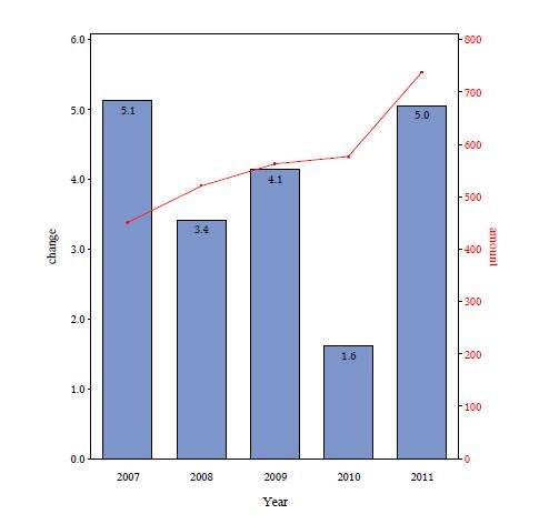
The issues are:
1) For the plot , I needed the amount to be plotted and not their SUM or MEAN...That is no statistics...How do I achieve this?
2) Can I plot all the values on the line (i.e., all the quarter values) not just values at midpoint? (that is the bars will be yearly mean of one of the
variable(change) while plot should be representing the exact value of the other variable (amount) for all the quarters (but no mean/sum) )
Thanks!
- Mark as New
- Bookmark
- Subscribe
- Mute
- RSS Feed
- Permalink
- Report Inappropriate Content
Hello Experts,
Please help me with your suggestions!!![]()
-VK

- Mark as New
- Bookmark
- Subscribe
- Mute
- RSS Feed
- Permalink
- Report Inappropriate Content
The reason your periods are grouped is the use of : Foramat period year4.; which is telling SAS to group and display by year. Use YYQ6. YYQS8. or similar.
If the data is already summarized as it appears in your case the choice of statistic doesn't matter but the procedure does expect to have a statistic. I think with the format change above you'll get what you're looking for.
- Mark as New
- Bookmark
- Subscribe
- Mute
- RSS Feed
- Permalink
- Report Inappropriate Content
Thanks Ballard for you reply. Your explanation is correct!
But, I have used YEAR4. because I want yearly average per BAR...
and for the plot I wanted all the points plotted. But the problem is that the plot is plotting at midpoints only. Is there some trick to have plot display all the values?
In short, for BAR... it should group while for PLOT it should not group.

Don't miss out on SAS Innovate - Register now for the FREE Livestream!
Can't make it to Vegas? No problem! Watch our general sessions LIVE or on-demand starting April 17th. Hear from SAS execs, best-selling author Adam Grant, Hot Ones host Sean Evans, top tech journalist Kara Swisher, AI expert Cassie Kozyrkov, and the mind-blowing dance crew iLuminate! Plus, get access to over 20 breakout sessions.
Learn how use the CAT functions in SAS to join values from multiple variables into a single value.

Find more tutorials on the SAS Users YouTube channel.
 Click image to register for webinar
Classroom Training Available!
Select SAS Training centers are offering in-person courses. View upcoming courses for:
-
3 replies
-
10-28-2012 05:31 PM
-
497 views
-
0 likes
-
2 in conversation
-
