- Home
- /
- Programming
- /
- Programming
- /
- how to choose to display some of the values
- RSS Feed
- Mark Topic as New
- Mark Topic as Read
- Float this Topic for Current User
- Bookmark
- Subscribe
- Mute
- Printer Friendly Page
- Mark as New
- Bookmark
- Subscribe
- Mute
- RSS Feed
- Permalink
- Report Inappropriate Content
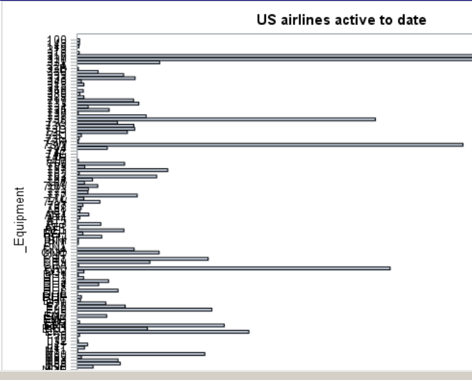
the names on the yaxis are overlap because two many values.
Can I just choose some values to display? e.g. choose formmer three values with a higher frequency.
I use the flowwing code to draw the plot
PROC SGPLOT DATA= Us_flight;
HBAR _Equipment ;
YAXIS FITPOLICY = NONE;
RUN;Accepted Solutions
- Mark as New
- Bookmark
- Subscribe
- Mute
- RSS Feed
- Permalink
- Report Inappropriate Content
It might be simpler to make your value labels smaller with FITPOLICY=NONE VALUEATTRS=(size=5);
- Mark as New
- Bookmark
- Subscribe
- Mute
- RSS Feed
- Permalink
- Report Inappropriate Content
You could try combining VALUES= and VALUESDISPLAY= option in the YAXIS statement.
YAXIS FITPOLICY=NONE VALUES=("A" "B" "C") VALUESDISPLAY=("A" "" "C");
will display values for A, B, and C but labels for A and C only.
- Mark as New
- Bookmark
- Subscribe
- Mute
- RSS Feed
- Permalink
- Report Inappropriate Content
It might be simpler to make your value labels smaller with FITPOLICY=NONE VALUEATTRS=(size=5);
Don't miss out on SAS Innovate - Register now for the FREE Livestream!
Can't make it to Vegas? No problem! Watch our general sessions LIVE or on-demand starting April 17th. Hear from SAS execs, best-selling author Adam Grant, Hot Ones host Sean Evans, top tech journalist Kara Swisher, AI expert Cassie Kozyrkov, and the mind-blowing dance crew iLuminate! Plus, get access to over 20 breakout sessions.
Learn how use the CAT functions in SAS to join values from multiple variables into a single value.
Find more tutorials on the SAS Users YouTube channel.
 Click image to register for webinar
Classroom Training Available!
Select SAS Training centers are offering in-person courses. View upcoming courses for:


