- Home
- /
- Programming
- /
- Programming
- /
- Incorrect Display Proc Chart Group from Proc Format
- RSS Feed
- Mark Topic as New
- Mark Topic as Read
- Float this Topic for Current User
- Bookmark
- Subscribe
- Mute
- Printer Friendly Page
- Mark as New
- Bookmark
- Subscribe
- Mute
- RSS Feed
- Permalink
- Report Inappropriate Content
I am analysing an excel survey. Responses that have text value, they are recorded in numeric form. Example:
Q1. How often does your household purchase food from a grocery store?
9 Never
10 Once a month or less
11 2-3 times a month
12 Weekly
13 2-3 times a week
14 Daily
The column for that question having only number values.
For a question where the answer is on a scale from 1 to 10, I have made a proc format to group responses into categories.
When charting the questions, the grouping are not working.
My code is:
data survey;
set mylib.thesisdata2;
rename VAR4=Q1;
rename VAR6=Q3;
run;
proc format;
value typea
0='.'
9='Never'
10='Once a month or less'
11='2-3 times a month'
12='Weekly'
13='2-3 times a week'
14='Daily';
run;
proc format;
value typec
low-<4 = 'Low 1-3'
4-<7= 'Medium 4-6'
7-high='High 7-10';
run;
proc format;
run;
proc chart data=Survey;
vbar Q1 / type=percent;
format Q1 typea.;
title 'How often does your household purchase food from a grocery store?';
run;
proc chart data=Survey;
format Q3 typec.;
vbar Q3 / subgroup=vermont;
title 'How knowledgeable do you think you are about organically grown fresh
produce?';
run;
proc freq data=Survey;
format Q1 typea.;
format Q3 typec.;
tables Q1 Q3;
run;
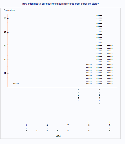
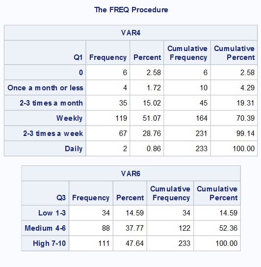
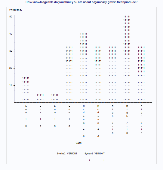
And the results are:

Thanks
- Mark as New
- Bookmark
- Subscribe
- Mute
- RSS Feed
- Permalink
- Report Inappropriate Content
I haven't seen Proc Chart code in more than 25 years.
By "wonky" I am guessing that you refer to axis appearance.
The first chart, for Q1, the procedure is guessing how many axis values and has created bins that center on those displayed values, only two of which center on a value defined in the discrete format
In the second, for Q3, the axis is being treated as discrete numeric values and repeating the range format that is used for each discrete value.
Add the AXIS option to indicate where you want your tick marks and DISCRETE if you want each value displayed.
Is there some specific reason you are using Chart instead of SGPLOT or Gchart either of which will create groups based on formatted values?
Don't miss out on SAS Innovate - Register now for the FREE Livestream!
Can't make it to Vegas? No problem! Watch our general sessions LIVE or on-demand starting April 17th. Hear from SAS execs, best-selling author Adam Grant, Hot Ones host Sean Evans, top tech journalist Kara Swisher, AI expert Cassie Kozyrkov, and the mind-blowing dance crew iLuminate! Plus, get access to over 20 breakout sessions.
Learn how use the CAT functions in SAS to join values from multiple variables into a single value.
Find more tutorials on the SAS Users YouTube channel.
 Click image to register for webinar
Classroom Training Available!
Select SAS Training centers are offering in-person courses. View upcoming courses for:


