Benefits of a Scrolling Layout
- You can put more information on a single page without overwhelming your audience.
- Graphs can be larger.
- Ensures a better viewing experience on mobile.

What is a scrolling report? When should I create a scrolling report?
There are two different ways to lay out report pages in Visual Analytics. There is a scrolling layout and there is a "fit to screen" layout. Both styles require your user to interact with your report in different ways. The scrolling page layout has become more of an expected format for non-presentation style documents because of the rise of the web.
To get started designing a scrolling layout you must first set your page to scroll. The default layout style for Visual Analytics reports is to fit to screen. Go to the Options pane, and select the page you want to scroll at the top. Under Layout deselect the "Avoid scrollbars" setting. Once you have changed the setting, you are able scroll down and put more objects underneath.

A scrolling layout is a powerful way to create an effective, beautiful report. You can create a header area at the top of your page without sacrificing space from adjacent report objects. You can also add secondary textual information alongside graphs because the scrolling layout does not constrict your design.
Since the objects inside a scrolling layout are larger, this layout is fundamentally more mobile friendly.
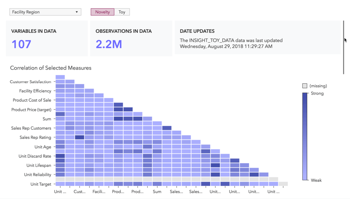
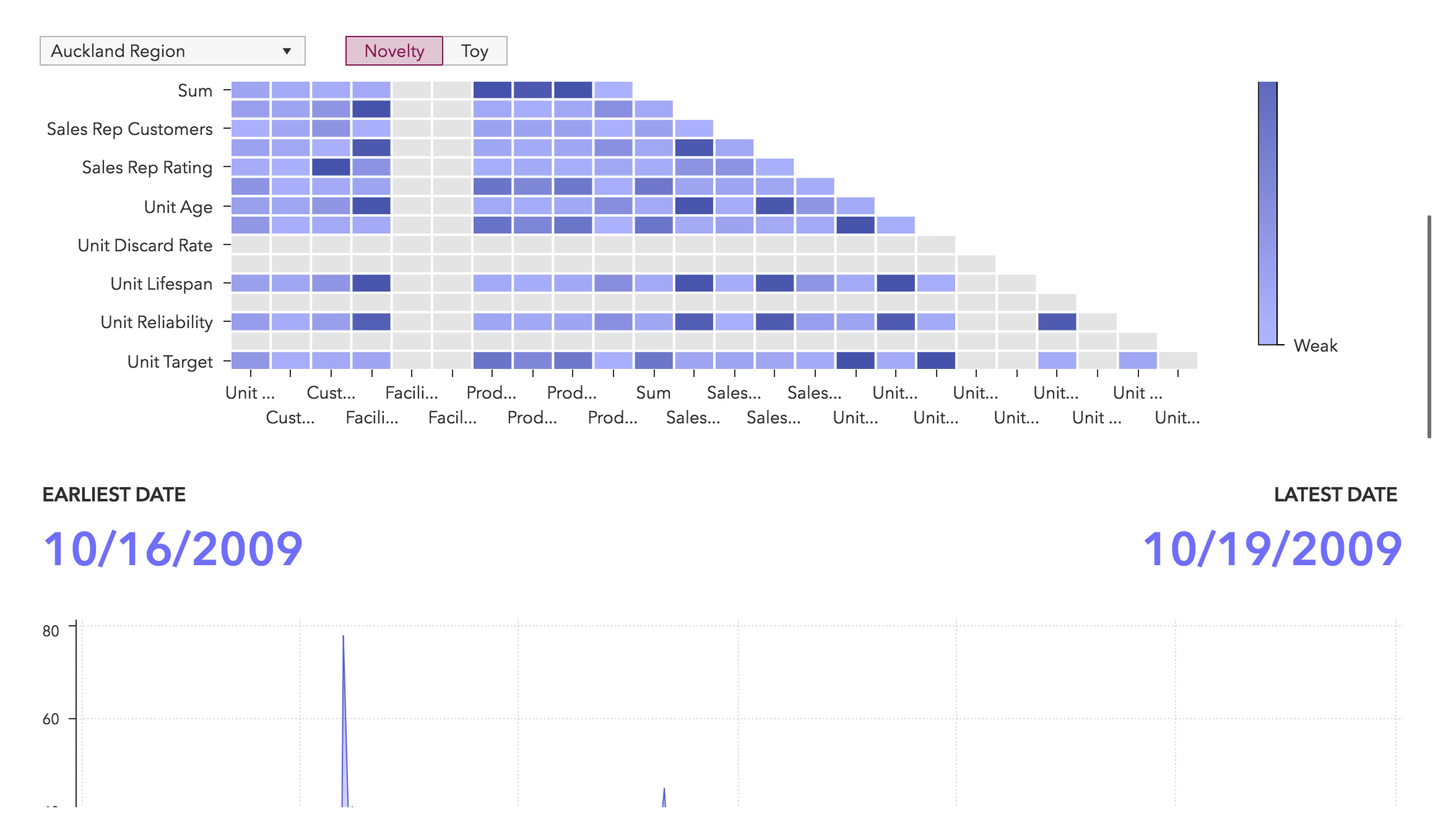
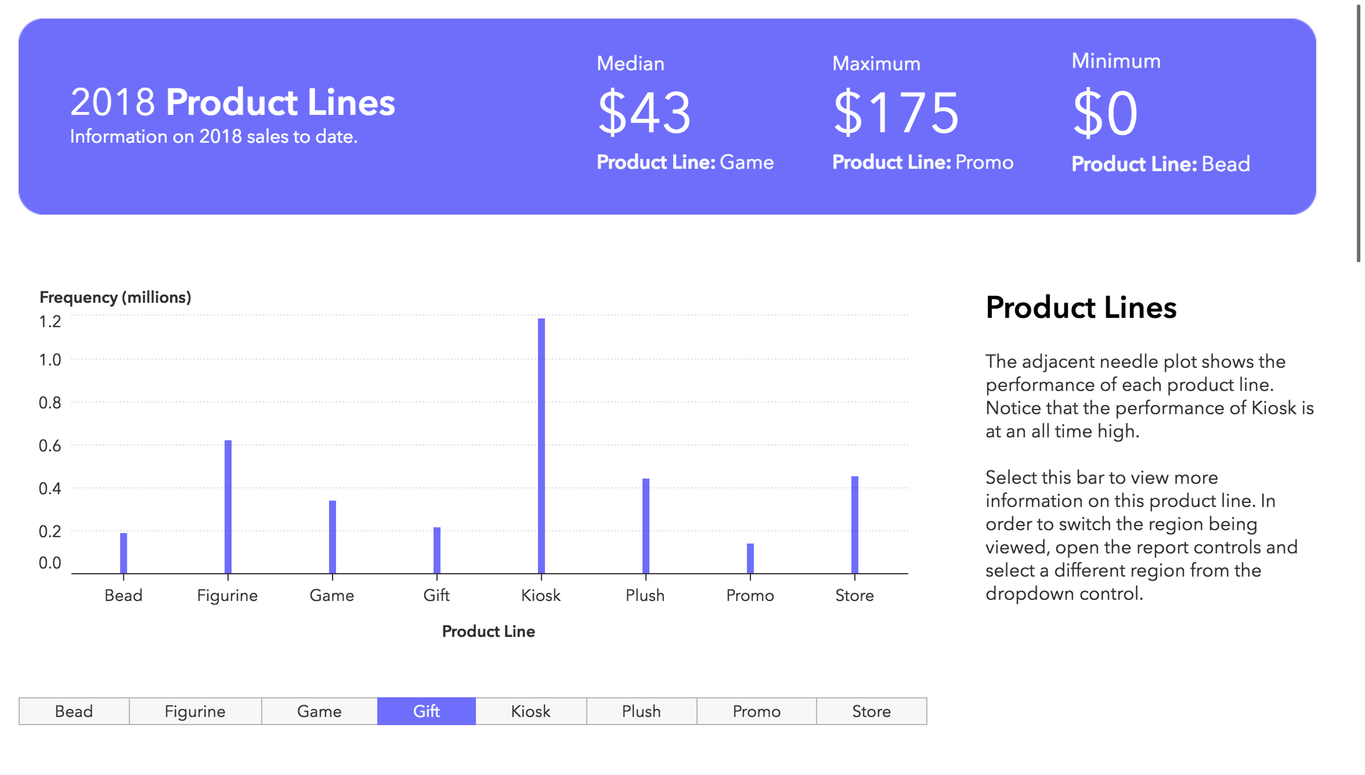
More space for report objects means that you can add text objects to smaller graphs providing the audience with additional information. This contextual information could be focused on the object, how to use the report, or key data insights. The report below takes advantage of the scrolling layout by providing a colorful, dynamic header as well as an accompanying text box which provides information on the needle plot.
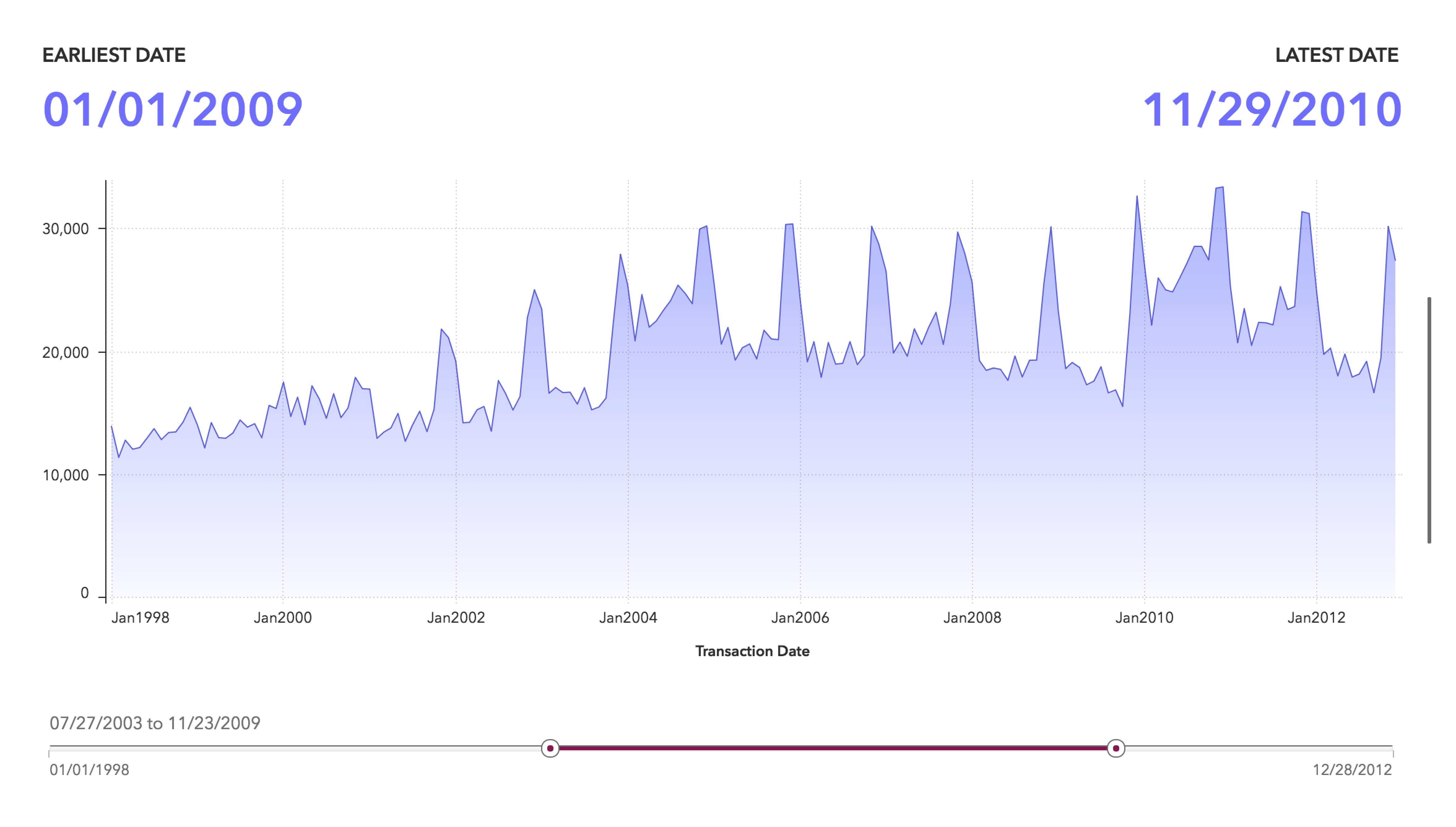
You can use the height of the screen to draw your audience's attention. In the image below, the line chart takes up the majority of the vertical space. The slider filters the line chart, and the key value indicators provide metrics. This grouping of objects was created by specifying the height of each object as a percentage of the height of the screen. If a height had not been specified for the time series, it would have taken up 100% of the screen. The report shown here specified 70% height for the time series, with the remainder of the space taken up by the slider and key values.
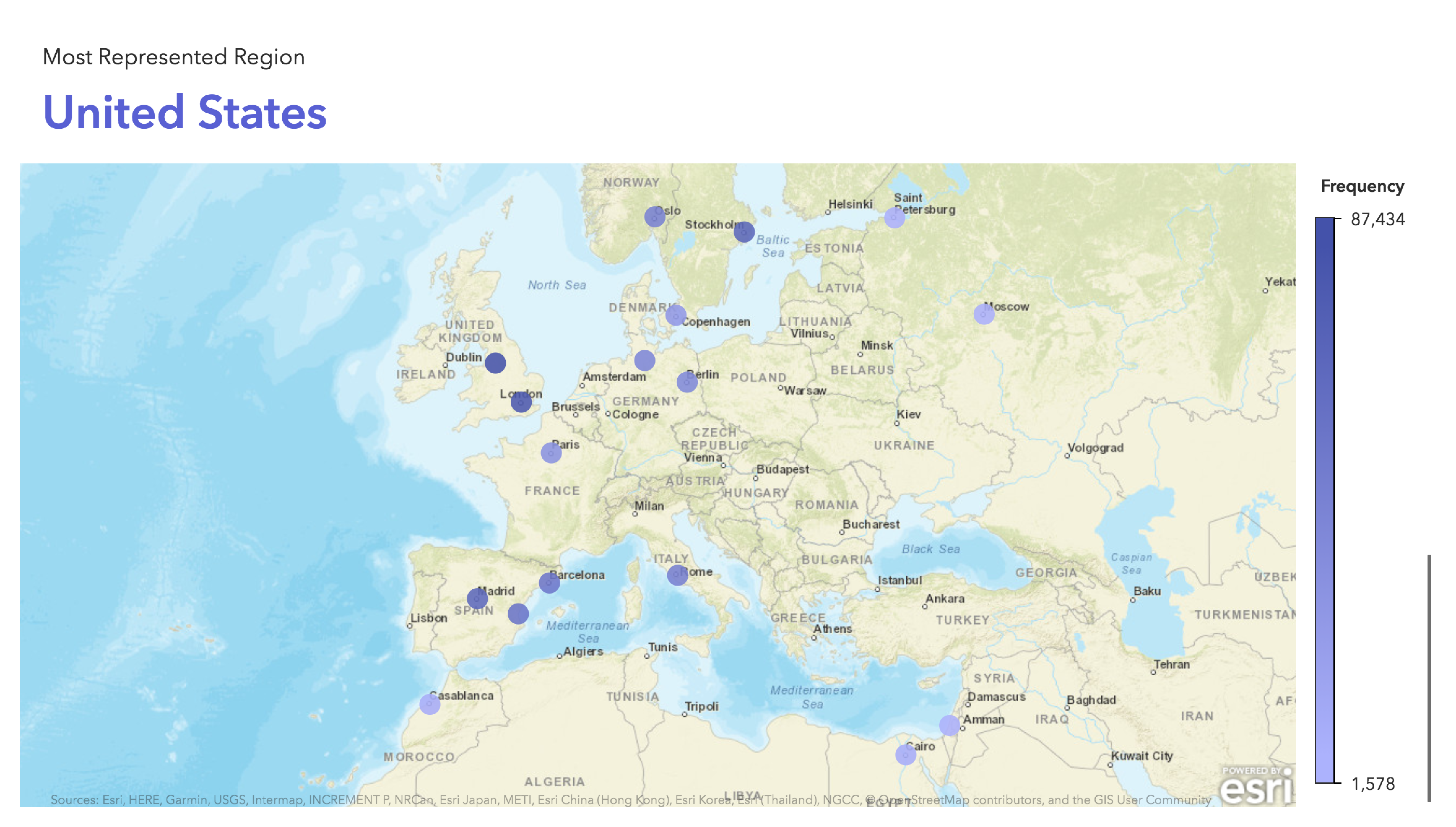
Most graph objects benefit from being larger, especially geo maps. Geo maps are visually stimulating. The more space you can give a geo map in your report, the more opportunities your audience will have for interactivity. If you have a report with geographic data, try a scrolling report and ensure your map has plenty of room for interaction, similar to the one below.
Providing your report viewer accurate filter context is vital to the integrity of your report. Visual Analytics has the tools to ensure your report viewer always has access to filter controls. The page controls built into Visual Analytics can be expanded and collapsed to give your viewers more flexibility. If the page controls are expanded while scrolling, the controls remain visible at the top of the page, ensuring your viewers always know what state their report is in.