This report uses the same blue color from the visualization in the title.
When used well, color can enhance your data story.
Adding color for the sake of adding color results in visual clutter. Instead, focus your audience's eye by using only a few colors. This is a key strategy in the world of design. Less is more. When in doubt, save color for data visualization only. If you must use color outside of your visualization, make sure to use a color already in your color palette.
Your audience will have difficulty reading charts that use more than 12 colors. If a chart has more than 12 categories, color is a poor way to distinguish the categorical data.
This report uses the same blue color from the visualization in the title.
Minimizing the use of color in your report will make your data story easier to understand. It helps your audience focus on the right thing without being distracted or misled by color meanings.
Do not vary the colors used from chart to chart, or page to page. Differing colors are distracting. By using consistent colors, you keep the focus on the content of the visualization. Also, unless you're emphasizing certain graphs over others, do not distract your audience from the data story by including large areas of color. Area charts, such as pie charts or geographical maps, contain a lot of color. Axis charts, such as line charts or scatter plots, contain a small amount of color. Consider using a mix of these two groups of charts, as well as carefully adjusted color, to balance the page.
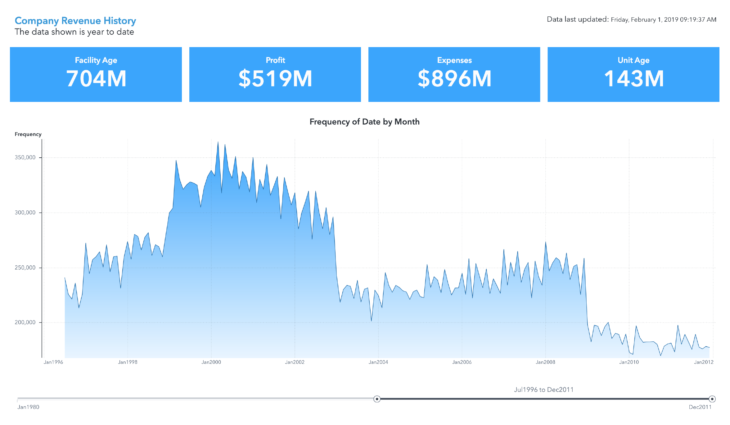
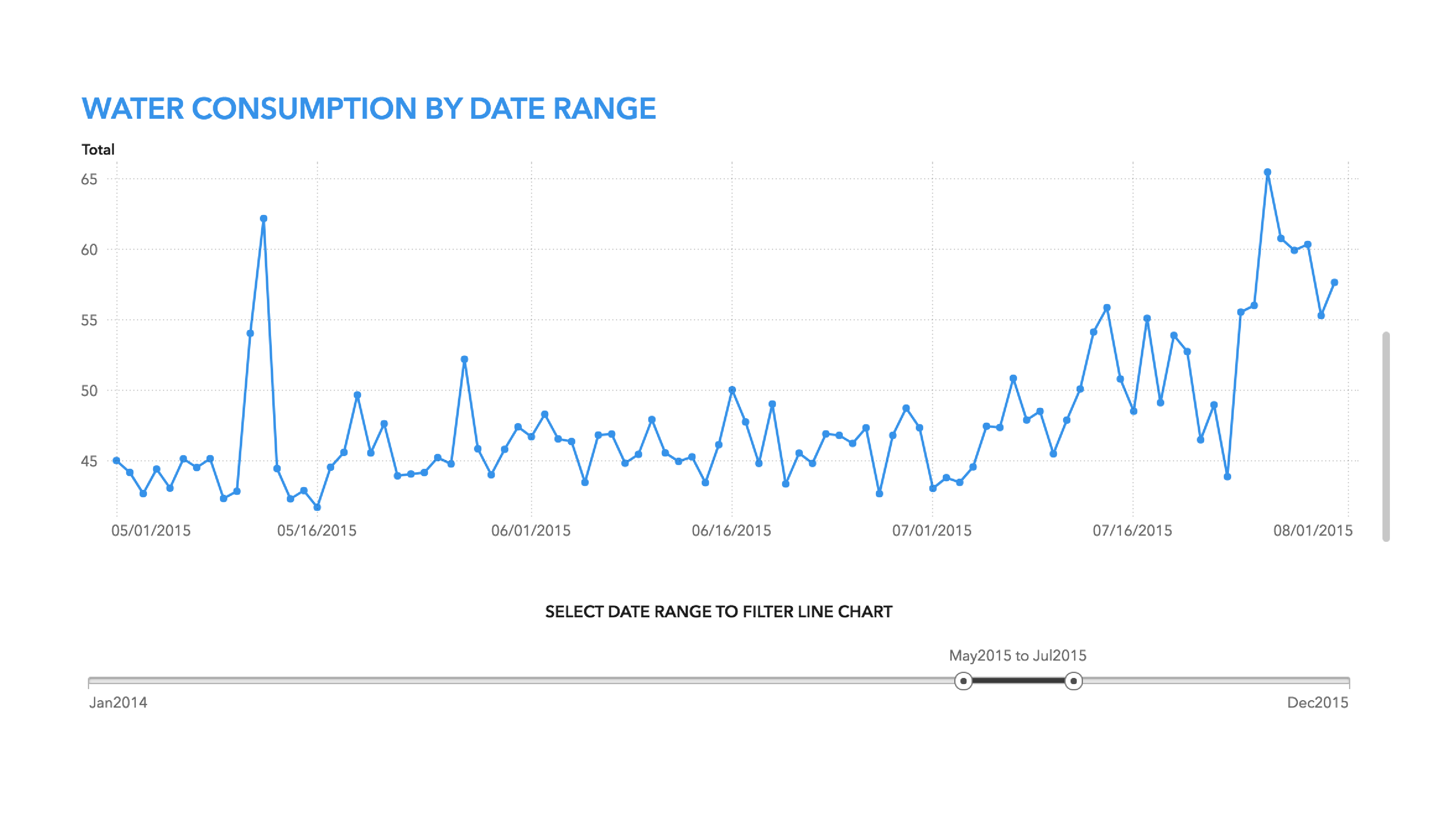
This report balances the amount of color in the line chart using background color on each of the key value indicators.
Use consistent colors for tick values, tick marks, axis labels, and informational aspects of the graphs and charts. Your audience needs to see these informative features to fully understand your data.
You can use neutral colors such as beige, ivory, taupe, black, gray, and shades of gray to add depth without being overbearing. For example, neutral colors work well as background colors and colors for informational aspects of graphs because they allow the foreground colors to pop.
Also, consider using neutral blocks of background color in your report to help divide the space. This treatment visually separates portions of your page and creates visual interest while promoting hierarchy.
TIP: To achieve a tiled look on your report objects, use a light grey background (color code #f4f4f4) along with a white border.
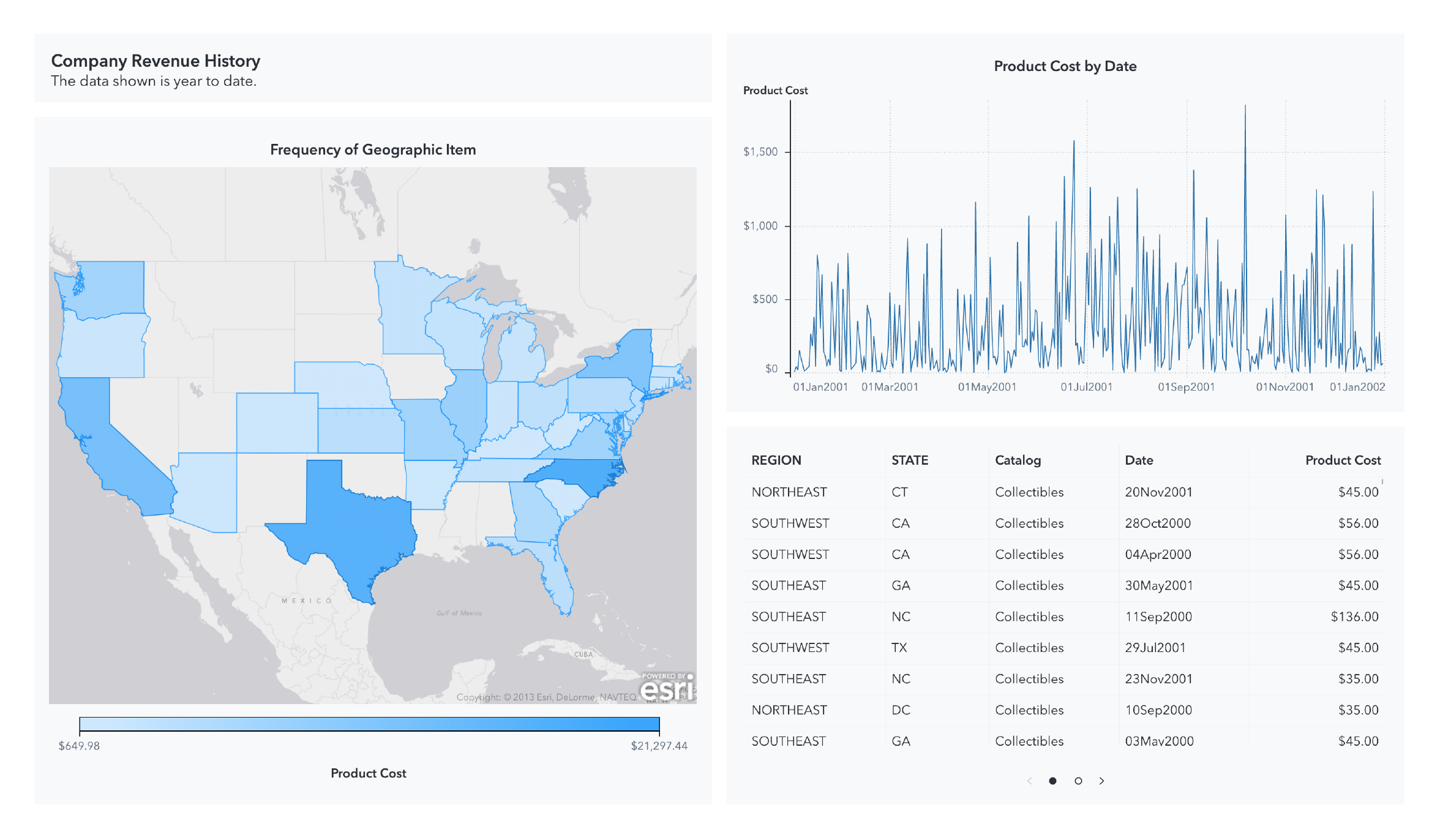
The backgrounds on the objects above use a neutral grey background and a white border to create visual boundaries between objects
In addition to being visually pleasing, report and graph palettes shipped with SAS Visual Analytics are optimized to enhance readability for as many users as possible. The graph palette cycles through warm and cool colors, while avoiding hues which might trigger inappropriate combinations or meanings.
Also, instead of relying on the amount color, use display rules to call attention to certain portions of your data visualizations. For example, if you are focused on sales in European countries, you can create a rule so that only sales figures related to European countries have a yellow background color.
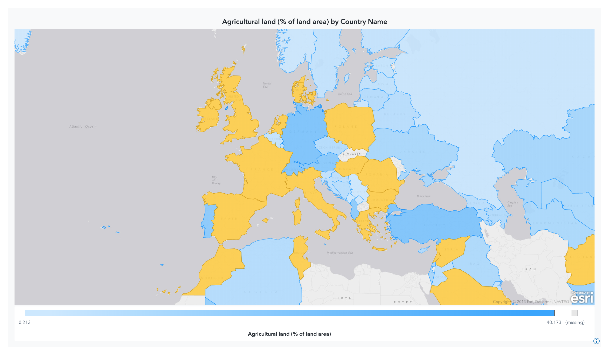
The geo map above uses a color-based display rule to call attention to portions of the data.
Some visualizations like heat maps and geo maps use color ramps to communicate a range of values. A color ramp is a progression of colors whose positions are defined by the data. The colors move from lighter to darker, or vice versa, depicting the range of data values. This kind of sequencing of colors helps audience members who struggle to distinguish colors because the approach uses lightness rather than hue to establish separation and meaning. When including a visualization that uses a progression of colors avoid the temptation to use two different hues such as green and yellow. The midpoint of two separate hues is often less pleasing to the eye.