The best way to help your report viewers understand your data is to keep your visualizations simple:
Stick to the simplest and most familiar visuals to communicate your data: bar charts and line charts, for example.
Use only the most important data items in your visuals. Strive to use as few data items as possible. If your viewer doesn’t need to pay attention to a particular data item in a specific visual, then leave it out. The more data you include, the greater chance the viewer has of missing the point of your graph.
If you have many categories, consider adding a filter - or grouping the categories - to limit the number of data values shown in the visualization.
Avoid using dual-axis charts unless your viewers are highly familiar with them. Most report viewers misinterpret data shown on charts with two different Y axes. It is better to show two single-axis graphs instead.
Use a zero baseline when possible. Your report viewers will assume a zero baseline and may incorrectly interpret the data if you use a different baseline.
Table, Text, or Graph?
One of the fundamental decisions for visualizing your data is whether to use a table, text, or a graph. Depending on your data, each approach can be useful:
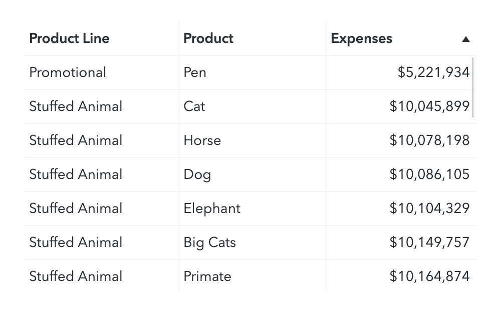
Use tables:
When the viewer will compare specific data values.
When precise numeric values are needed.
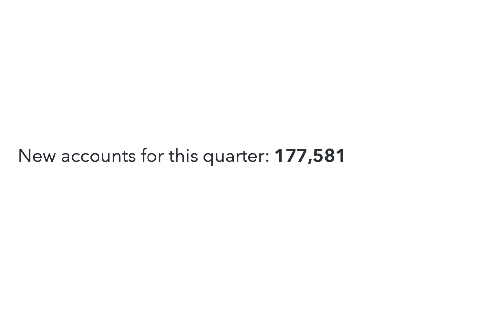
Use text:
When the most important message is a single data value.
When placing the value in a sentence adds helpful context.
Use graphs:
When you want to show distributions or trends in the data. Even the simplest trends and patterns in data can be difficult to spot in a table.
When the viewer will compare sets of values, rather than individual ones.
Often it is a good idea to represent the same data as both a graph and a table so that the viewer has the visual impact of a graph and they can examine the detail data in the table if they are interested in specific values. This approach also improves accessibility for visually-impaired viewers.
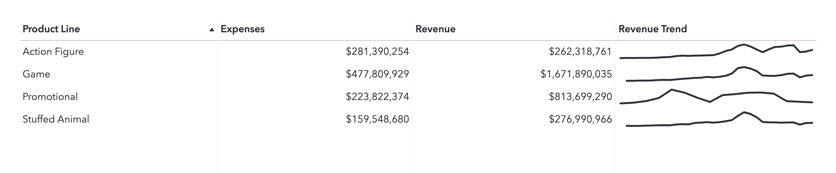
Cell graphs or sparklines within your tables sometimes offer the best of both worlds between tables and graphs.
Go-To Visualizations for Basic Data
Here are some quick go-to visuals for basic data scenarios:
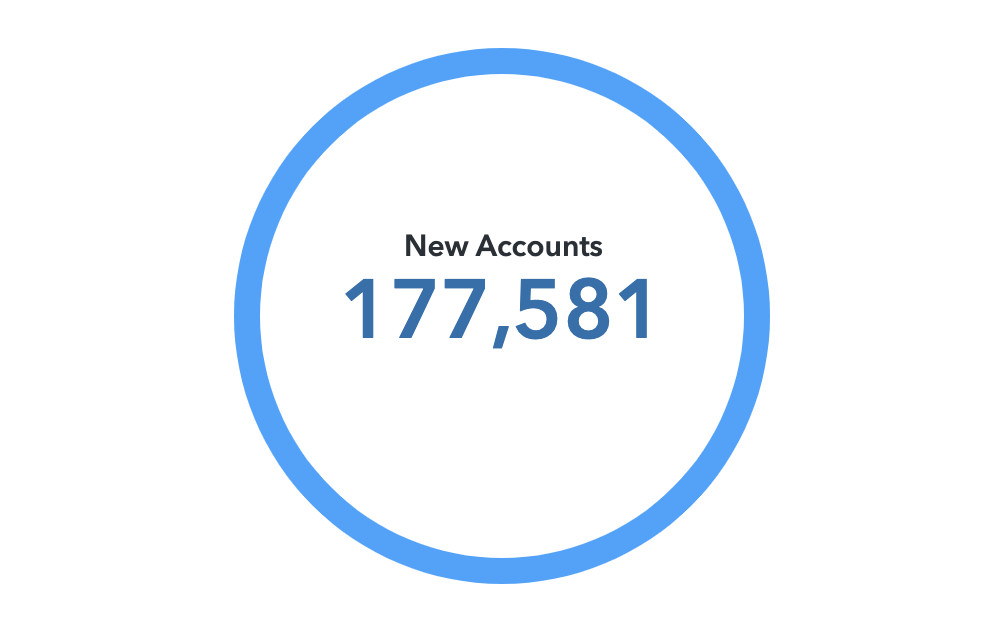
One Measure Value
Key value object is available in SAS Visual Analytics 8.3 and later. Dynamic text is available in SAS Visual Analytics 7.4 and later.
Key Value Object
Text Object
Data where individual values will be compared
Crosstabs are potentially very confusing if complex hierarchies are assigned to the axes. Keep the data in your crosstab as simple as possible to prevent your audience from getting lost.
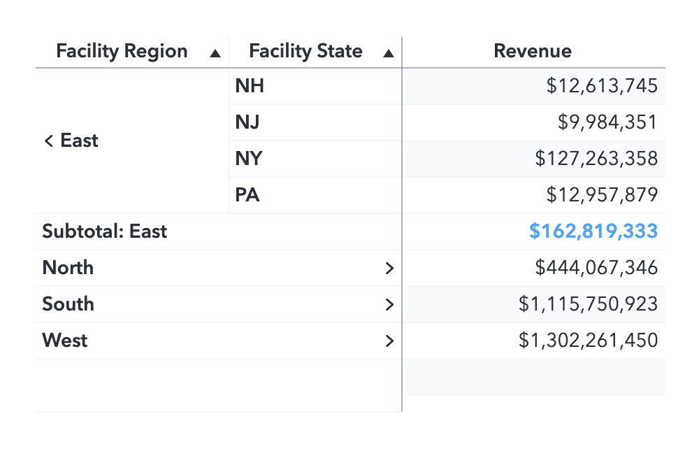
Table
Crosstab
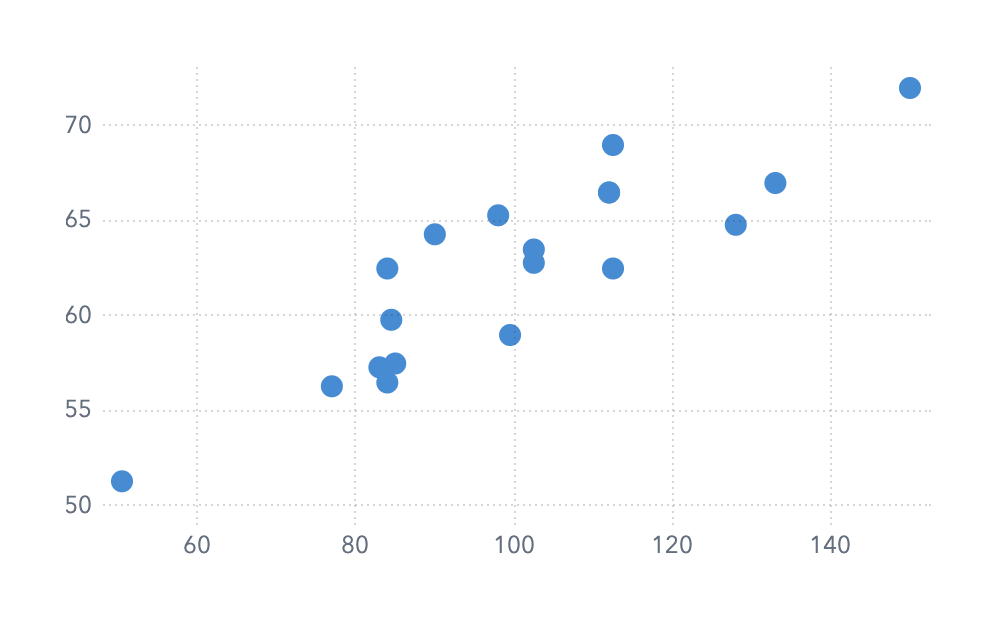
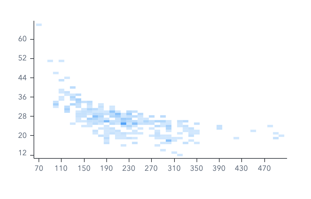
Distribution of values between two measures
Scatter plots are useful for a small number of values. Heat maps can represent a very large number of values.
Scatter Plot (few values)
Heatmap (many values)
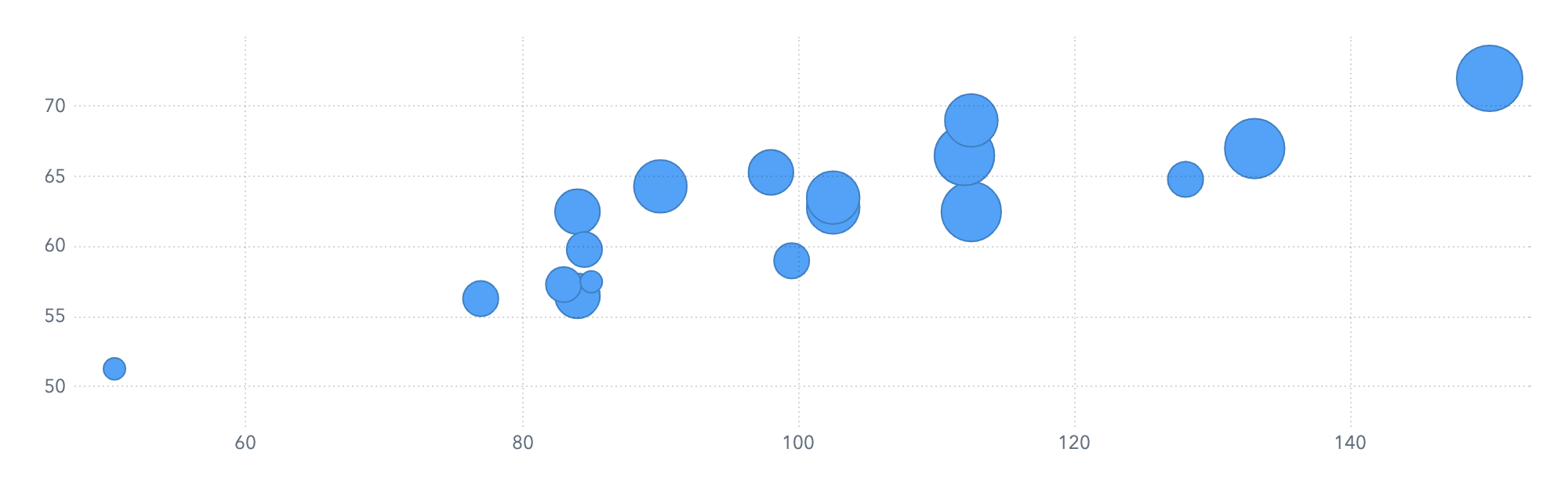
Distribution of values between three measures
Bubble Plot
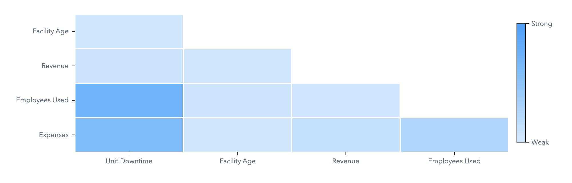
Correlations between any number of measures
Correlation Matrix
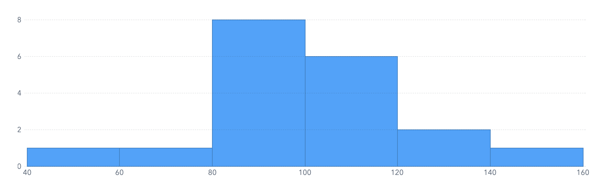
Distribution of values within one measure
Histogram
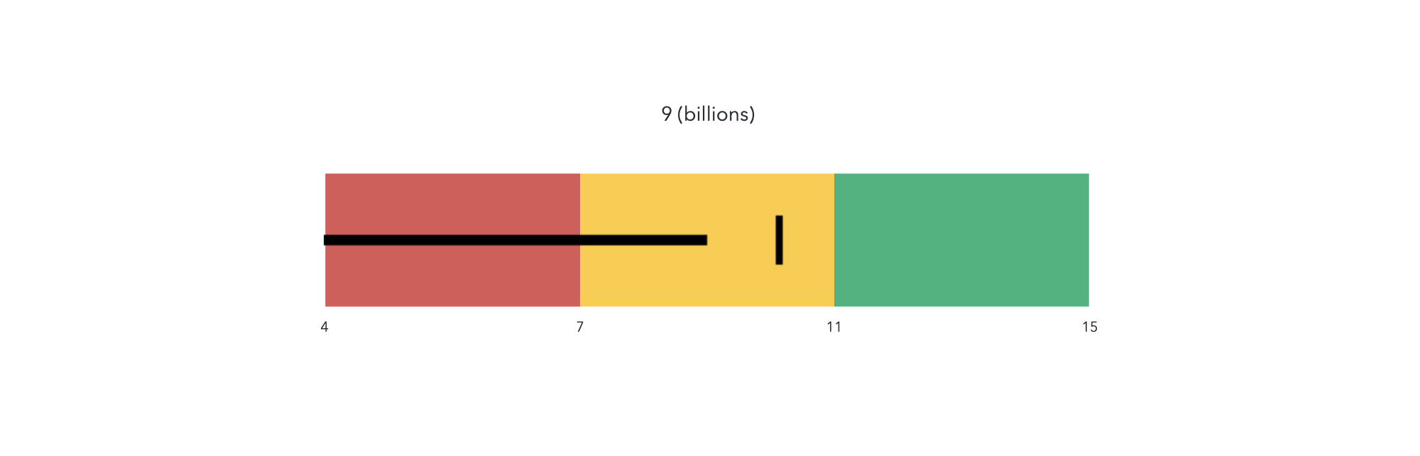
Target value versus actual value
The bullet gauge is recommended because of its simplicity. Other types of gauges, such as dials and speedometers, are visually distracting and less intuitive.
Gauge
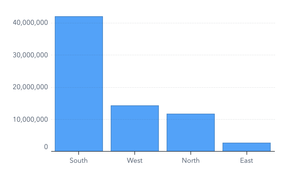
Measure values versus discrete category values
Bar charts should always be used with a baseline of zero. They can be very misleading otherwise. Where a different axis baseline is needed to differentiate similar values, use a dot plot. Horizontal and vertical orientations are both recommended. Choose the orientation that best accommodates your category labels.
Bar chart
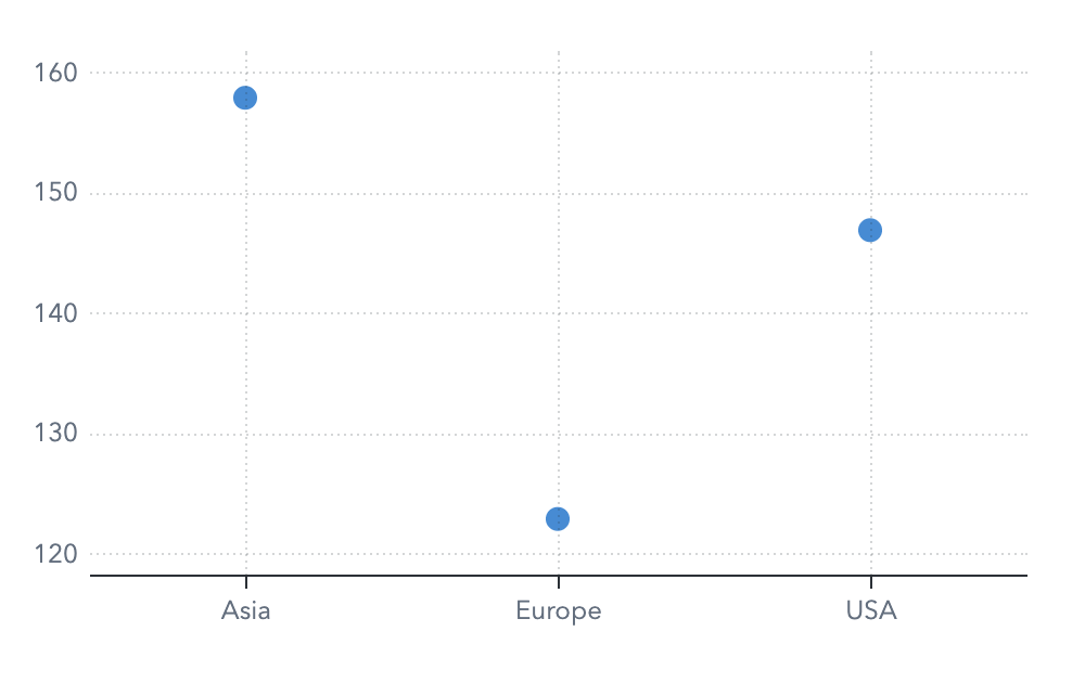
Dot plot (where the axis baseline is not zero)
Measure values versus continuous category values
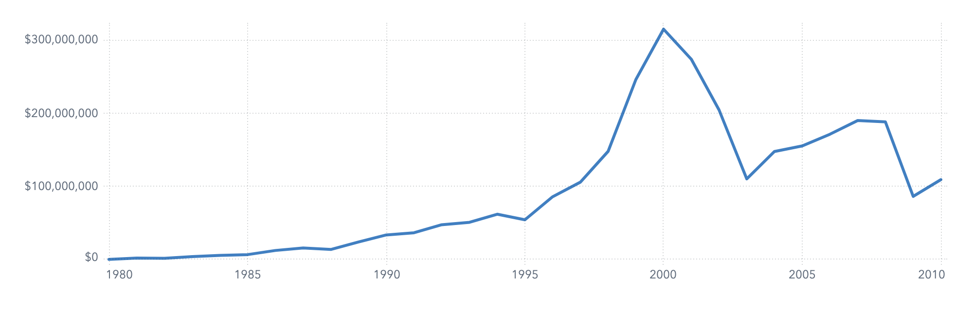
Time series plot
Value ranges
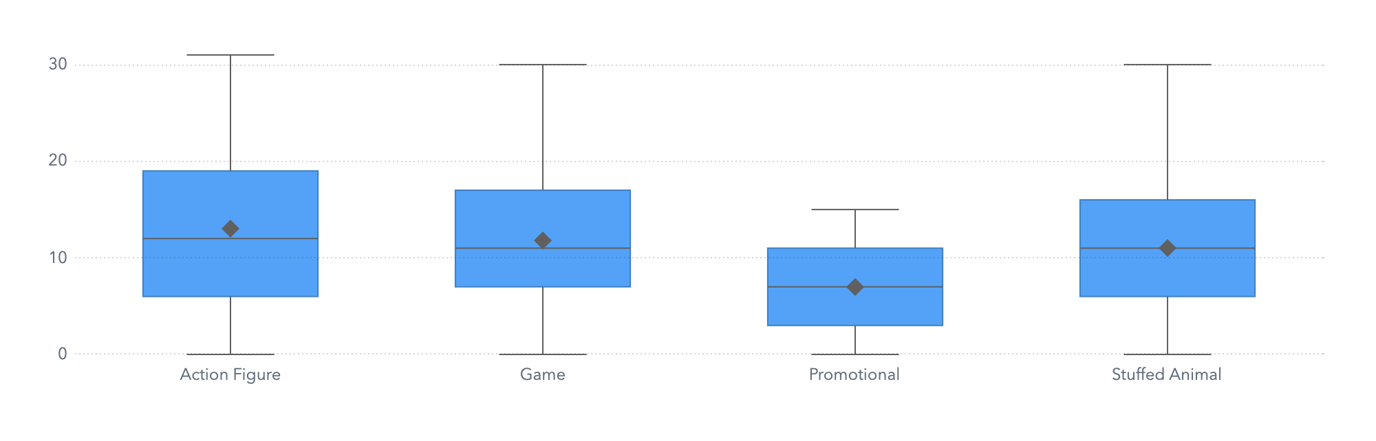
Box plots are unfamiliar to many people, so it might be helpful to provide an explanation along with the graph.
Box plot
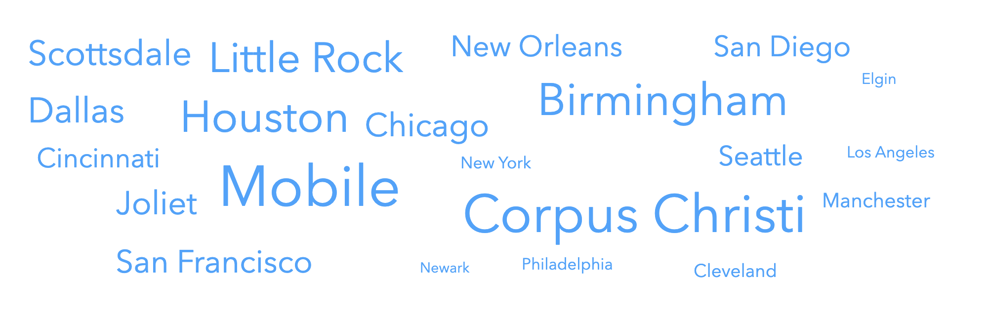
Frequency of category values
Word cloud
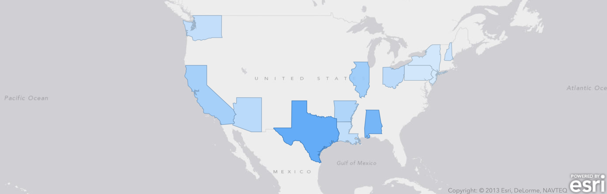
Geographic data
Geo map
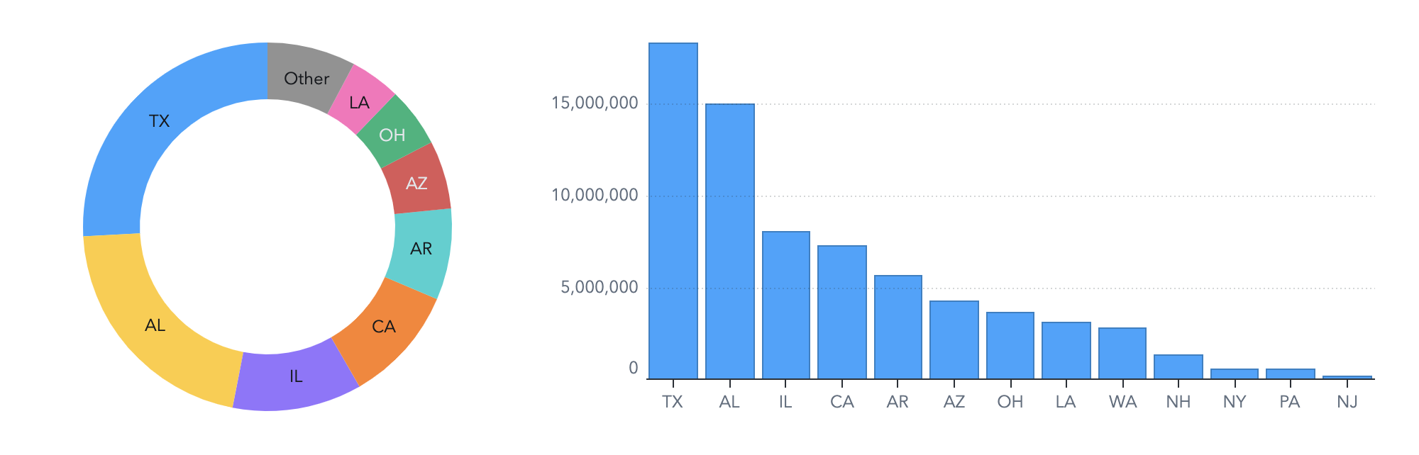
Use Pie Charts with Caution
Pie charts are one of the most familiar visuals for most people, but they can be problematic. Because humans are poor at comparing angles and volumes of shapes, it is difficult for your viewers to compare the values in a pie chart.
Try comparing the values of AR and IL in these charts. Which is easier?
If you do use pie charts in your report, it is best to follow these guidelines:
Use pie charts only to compare each segment to the whole.
Limit the number of segments in the pie chart.
Display the measure values or percentages in the chart so that viewers can read the actual values.