Creating your reports with accessibility in mind will help make sure everyone can understand them, including people with disabilities.
Consider the Abilities of Your Audience
If you publish your report to a wide audience, it will almost certainly include people with widely different levels of education and abilities. And it will include people with disabilities.
The types of report objects you choose greatly affects how easy it is to understand your report, and whether people with disabilities will be able to access it. Choose report object types that your audience will understand. The more conventional the object, the more people will be able to understand it, and in general, the more accessible it will be to people with disabilities. For example, bar charts are a mainstream, widely-understood chart type. Choosing a more unusual chart type may make your message less clear. It can also make the data more difficult to access for people who use assistive technology such as screen readers (software used by people without functional vision).
Avoid Using Sensory Characteristics Alone to Convey Meaning
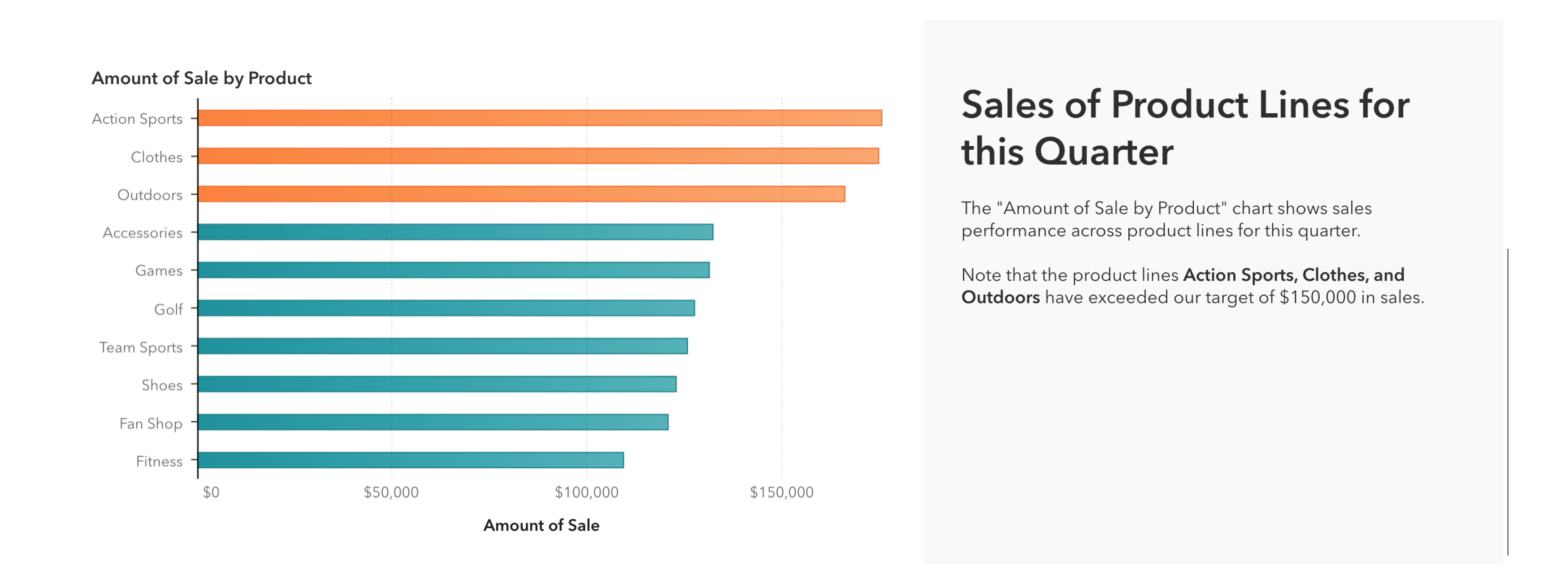
Sensory characteristics such as color, position, and size are powerful methods of conveying meaning within your report. You might denote particularly significant data in your report with a certain color. People who can differentiate this color from the others can easily spot the significant data. For people who cannot differentiate this color however, the effect will be lost. Be sure to include some secondary indicator of the meaning represented by the color – for example, if using color to illustrate that a certain value is above a threshold, you can include this information in text as well.
Avoid using sensory characteristics alone in labels or text within your report. Text describing “the chart on the right” is problematic. Text describing “the Sales by Quarter chart, on the right” is better, because the chart title is included along with its position.
The color rule applied to the visualization is explained in text.
Provide Accessible Alternative Representations of Data
Sometimes you’ll need to present data in a way that is not accessible to everyone. In these cases, you should add an alternative, accessible representation in addition to the inaccessible chart. The alternative representation can be as simple as a List table or, it can be a more mainstream, accessible type of chart. Whatever you choose, try to position the accessible representation of the data (or a link to it) very close to the inaccessible representation, so people can easily find it.
Creating a stacking container and adding the table of summary data alongside the visualization is an excellent way to create a more accessible report.