- Home
- /
- SAS Viya
- /
- VA Gallery
- /
- Comparing Australia's COVID-19 Vaccine Roadmap in SAS Visual Analytics
- RSS Feed
- Mark as New
- Mark as Read
- Bookmark
- Subscribe
- Printer Friendly Page
- Report Inappropriate Content
Comparing Australia's COVID-19 Vaccine Roadmap in SAS Visual Analytics
- Article History
- RSS Feed
- Mark as New
- Mark as Read
- Bookmark
- Subscribe
- Printer Friendly Page
- Report Inappropriate Content
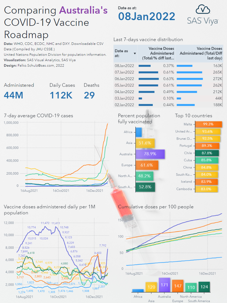
While #Australia managed to maintain relatively low case numbers so far, recent outbreaks signal that this #pandemic is far from over. A new effort in ramping up vaccination numbers seem to show an effect - now ranking Australia among countries with the highest numbers of doses administered daily per 1M population.

This SAS Visual Analytics report shows a snapshot (January 8th 2022) of the vaccine roadmap compared to other countries and continents. Other continents show data as average across all countries. The report uses a precision container layout structure allowing overlaying of visualizations on top of the background image. For more info on containers in SAS Visual Analytics, see related documentation.
Enjoy!
----------------------------------------------------------------------------------------
Update 17NOV21: Updated infographic with latest vaccination data
Update 09JAN22: Updated infographic with latest vaccination data / color palette fix for top10 bar chart
Don't miss out on SAS Innovate - Register now for the FREE Livestream!
Can't make it to Vegas? No problem! Watch our general sessions LIVE or on-demand starting April 17th. Hear from SAS execs, best-selling author Adam Grant, Hot Ones host Sean Evans, top tech journalist Kara Swisher, AI expert Cassie Kozyrkov, and the mind-blowing dance crew iLuminate! Plus, get access to over 20 breakout sessions.

