- Home
- /
- SAS Communities Library
- /
- Tricks for SAS Visual Analytics Report Builders: Step 1 - Draft a Plan
- RSS Feed
- Mark as New
- Mark as Read
- Bookmark
- Subscribe
- Printer Friendly Page
- Report Inappropriate Content
Tricks for SAS Visual Analytics Report Builders: Step 1 - Draft a Plan
- Article History
- RSS Feed
- Mark as New
- Mark as Read
- Bookmark
- Subscribe
- Printer Friendly Page
- Report Inappropriate Content
This is the first part of a six part series that describes tips and tricks for building impactful reports in SAS Visual Analytics.
- Draft a Plan (this article!)
- Choose the Best Chart
Bonus: Chart Best Practices - Focus on What’s Important
- Consider the Layout
- Test, Test, and Test Again
SAS Visual Analytics enables you to create compelling, interactive reports that can be viewed by anyone, anywhere. To create impactful reports that resonate with your audience you need to (1) draft a plan for the report, (2) choose the best chart type to display your data, (3) create your reports so viewers can focus on what’s important to them, (4) pick a layout that will best display your data and tell your data story, and (5) test the report to ensure it operates and looks the way you want. In this blog, we will focus on the first step in the process: Draft a Plan.
Draft a Plan
When drafting a plan, you need to select the data you want to use for the report, think about your audience, craft your data story, and sketch the design of the report.
Select your Data
Before you start creating your report in SAS Visual Analytics, you need to select your data. This data can be stored in any format (SAS datasets, Microsoft Excel files, database tables, or text files) and can even exist in multiple tables. You can combine the tables before using them in SAS Visual Analytics or you can create data joins and aggregated tables within your report. You can even use multiple data sources.
Pro Tip! As a best practice, you should prepare your data before using it in SAS Visual Analytics. Data joins and aggregated tables created in Visual Analytics use temporary CAS tables that are created for each user who views the report. This can impact the performance of your report. In addition, using SAS code to prepare your data will provide you with more advanced functionality (like functions that can improve data quality, multi-table joins, non-equijoins, and more).
You can also create a variety of data items in SAS Visual Analytics using one-click calculations (like the difference from the previous period or the distinct count), hierarchies (which enable you to view different levels of your data and create a drill-down functionality for your charts), geography data items (that can be used for mapping), parameters (which give report viewers more control over the report), and statistical data items (like interaction effects, spline effects, and partitions).
Know your Audience
Next, you need to determine the audience of the report. The needs and interests of your audience will determine what you present, how you present it, and the level of detail you’ll include in the report.
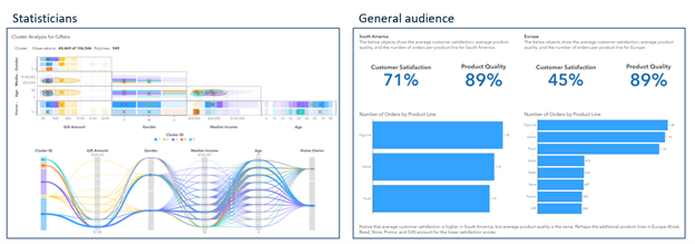
For example, if you are creating a report for statisticians, you might use models (like the Statistics and Machine Learning objects) and advanced analytic objects (like automated explanation, automated prediction, forecasting, network analysis, path analysis, and text topics). For this audience, these models will be self-explanatory, and you might not have to include a lot of detail about how the model works, the purpose of the model, and why it’s useful for the report. On the other hand, if you are building a report for a general audience (like the public or your non-statistician customers), you might want to use simpler graphs that are easier to interpret and understand. In addition, you might include additional instructions and explanatory text in the report to explain the purpose and usefulness of objects and the report itself.
Select any image to see a larger version.
Mobile users: To view the images, select the "Full" version at the bottom of the page.
In this example, a Cluster object (located in the Statistics group) is used in a report for statisticians, who understand the concepts of clustering and can easily interpret the various components. For a general audience, however, simpler objects (like key value objects and bar charts) are used instead, and explanatory text (using the Text object) is added to explain the layout of the report and state the conclusions.
Pro Tip! Regardless of your audience, it’s a best practice to provide instructions for using the report (including tips on navigating the interface, if necessary) and to give context to your graph content. This will enable your viewers to identify the key takeaways of the report and can incite them to act on those findings.
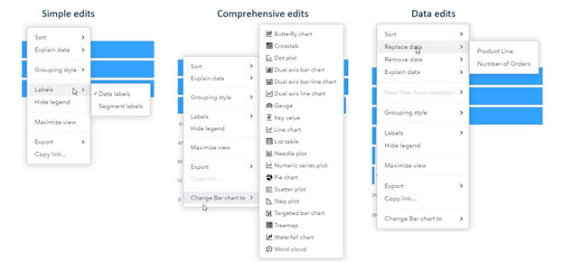
Your audience will also give you a good idea about the level of modifications you want to allow for the report. You can control the level of modification for each report by setting the Customization level for the report. The degree of customization can be adjusted from simple edits (that will enable viewers to modify simple options for the report, such as adding labels and hiding or displaying legends) to comprehensive edits (that will enable viewers to change chart types), to data edits (that will enable viewers to modify the data used in report objects, filters, and ranks).
This example shows the options available for a bar chart when the Viewer customization level is set to simple edits, comprehensive edits, and data edits.
Craft your Story
Your reports should focus on telling a single data story. When you begin to craft your story, consider these questions:
- Are you trying to persuade your audience?
- Are you presenting facts?
- Do you want the audience to act?
The answers to these questions will help you determine how to present your findings in the report and will help you start constructing your narrative. Storytelling helps your audience feel more connected to your report by eliciting emotion and triggering memory. Telling a good story that resonates with your audience will make it more likely that they will remember what the report has to say and will want to act on those findings.
Sketch Design
Finally, you should roughly sketch out the design of the report. This can be anything from a bulleted outline of the report, a rough table of contents, or a hand drawn draft of each page that shows the anticipated layout, the types of objects that will be used on each page, and an explanation of how each page contributes to the overall data story. You should always keep the story in mind when building the report, from the very first sketch to the fully completed, and tested report.
Also in this stage, you should start planning for accessibility. Think about the audience and what functionality they may need to better interact with your report. For example, you can plan to add a table representation for each graph to more easily enable viewers to see specific values, you can add simpler graphs as an alternative to more complex graphs, or you can add additional information about keyboard shortcuts in SAS Visual Analytics or more details for users of screen-reader technology.
Summary
Before you begin to create your reports in SAS Visual Analytics, you need to draft a plan. In this initial step, you need to select the data you want to use for the report, think about your audience, craft your data story, and sketch the design of the report.
In the next part of this series, we discuss best practices for choosing the best chart for displaying your data.
References
Documentation: Keyboard Shortcuts for SAS Visual Analytics
Documentation: Viewing Objects with SAS Graphics Accelerator
Documentation: Creating Accessible Reports Using SAS Visual Analytics
Documentation: Accessibility Features for SAS Visual Analytics
Telling Your Data Story by Atrin Assa
SAS Visual Analytics Stories are Data With a Soul by Ted Stolarczyk
Don't miss out on SAS Innovate - Register now for the FREE Livestream!
Can't make it to Vegas? No problem! Watch our general sessions LIVE or on-demand starting April 17th. Hear from SAS execs, best-selling author Adam Grant, Hot Ones host Sean Evans, top tech journalist Kara Swisher, AI expert Cassie Kozyrkov, and the mind-blowing dance crew iLuminate! Plus, get access to over 20 breakout sessions.
Free course: Data Literacy Essentials
Data Literacy is for all, even absolute beginners. Jump on board with this free e-learning and boost your career prospects.
Get Started
- Find more articles tagged with:
- data visualization
- GEL
- Report Best Practices
- reporting
- visual analytics


