- Home
- /
- SAS Communities Library
- /
- Tracking the rise and fall of an industry with SAS
- RSS Feed
- Mark as New
- Mark as Read
- Bookmark
- Subscribe
- Printer Friendly Page
- Report Inappropriate Content
Tracking the rise and fall of an industry with SAS
- Article History
- RSS Feed
- Mark as New
- Mark as Read
- Bookmark
- Subscribe
- Printer Friendly Page
- Report Inappropriate Content
Some books are instantly recognizable from their opening line. One of the most famous of these lines is “Call me
In this edition of Free Data Friday, we will be looking at data from whalinghistory.org to see what we can learn about the rise and fall of this once mighty industry and in the process learn how to identify and handle outliers in our data.
Get the data
The data is available for download from https://whalinghistory.org/ which is a collaborative project between Mystic Seaport Museum and New Bedford Waling Museum – you can download a zip file containing a number of tab delimited files. I have chosen to use the file containing details of voyages.
Get started with SAS OnDemand for Academics
Getting the data ready
Firstly, I used PROC Import to convert the data into a SAS file. I then created a summary table with fewer variables and limited it to records with a voyage rank equal to one. This was necessary to avoid double counting as some voyages have multiple records with the voyagerank variable indicating the record number.
filename reffile '/home/chris52brooks/Whaling/voyages_20211020.txt';

proc import datafile=reffile
	dbms=dlm
	replace
	out=voyages;
	delimiter='09'x;
	getnames=yes;
	guessingrows=3000;
RUN;

proc sql;
	create table summary
	as select
		voyageid,
		vessel,
		vesselid,
		sperm,
		oil,
		yearin,
		yearout,
		returncode
	from voyages
	where voyagerank=1
	;
quit;
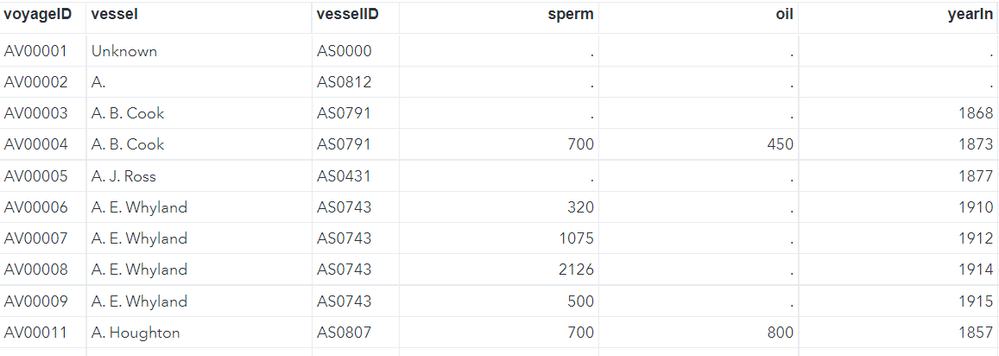
This gave me a file looking like this:
The results
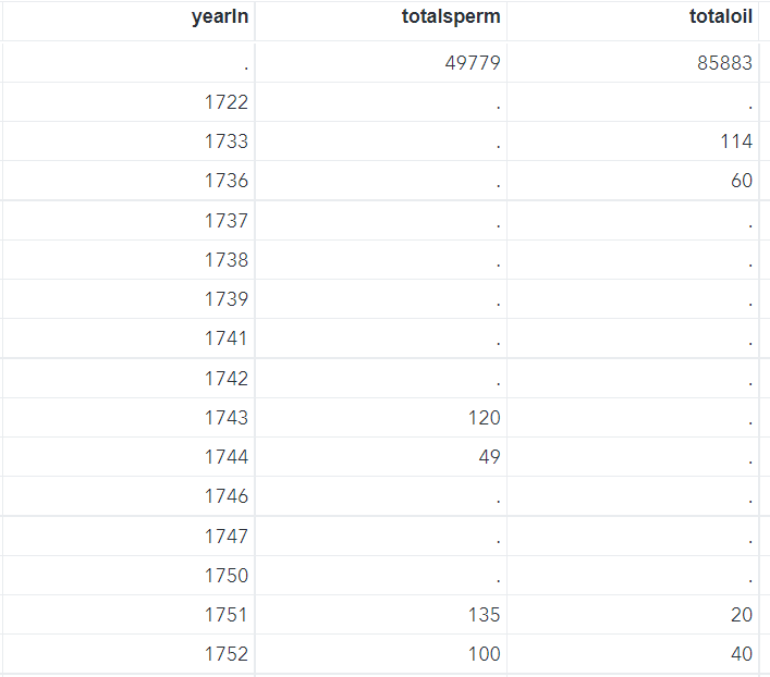
I first ran a simple PROC SQL statement to create annualised totals for a couple of the variables and then decided to use the values for barrels of oil landed to further analyse my data.
proc sql;
	create table annuals
	as select distinct yearin,
	sum(sperm) as totalsperm,
	sum(oil) as totaloil
	from summary
	group by yearin;
quit;
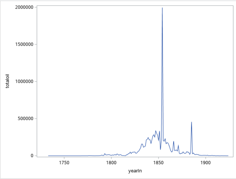
I could now run a basic PROC SGPlot to get some sense of what the data looked like. I chose to use total oil landed as my metric.
proc sgplot data=annuals;
	series x=yearin y=totaloil;
run;
The massive spike in the 1850s rings immediate alarm bells here – when I look at the data in the annualised data set it is clear that I need to investigate this further.
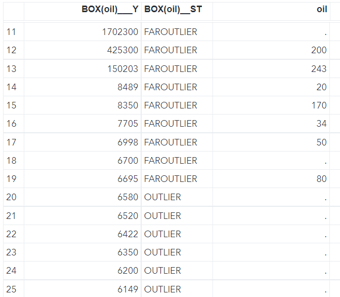
The value for total oil in 1854 is huge whereas the value for sperm is roughly equivalent to other, nearby years. In order to see what happened here in detail I decided to check for outliers i.e. unfeasibly large numbers appearing in the data. There are a number of ways of doing this but I decided to create a boxplot of the disaggregated data which highlights any extreme values. Here is the code I used – note that the ODS statement creates a data set holding the values of these outliers.
ods output sgplot=outliers;
proc sgplot data=summary;
    vbox oil;
run;
You can see from the output file that quite a few outliers were detected along with some ‘faroutliers’.
I now had to decide what to do with these values. I can understand why there may be some exceptional values in the data; voyages often lasted several years, and it is entirely possible that their numbers may be much larger than voyages which were cut short for some reason. Also size of ship, hunting grounds, whale migration patterns etc may all well have played a part in this variation. However, some of the faroutliers look simply too big to be realistic and I believe that they may be caused by either recording or transcribing errors. I decided therefore to remove them from the analysis by going back to the original imported voyages file and excluding them.
proc sql;
	create table cleanvoyages
		as select *
		from voyages
		where oil not in
			(select 'BOX(oil)___Y'n
				from outliers
				where 'BOX(oil)__ST'n="FAROUTLIER")
		;
quit;

proc sql;
	create table cleansummary
	as select
		voyageid,
		vessel,
		vesselid,
		sperm,
		oil,
		yearout,
		yearin,
		returncode
	from cleanvoyages
	where voyagerank=1
	;
quit;
I then re-aggregated the data and generated my final series chart, adding in tooltips, colors and generally making the whole chart look better.
proc sql;
	create table cleanannuals
	as select distinct yearin,
	sum(sperm) as totalsperm,
	sum(oil) as totaloil
	from cleansummary
	group by yearin;
quit;

ods graphics / reset imagemap;
proc sgplot data=cleanannuals(where=(yearin>1799 and yearin<1900));
	title1 "The 19th Century US Whaling Industry";
	title2 "Barrels of Oil Landed per Year";
	footnote j=r "Data From https://whalinghistory.org/";
	series x=yearin y=totaloil /
		tip=(yearin totaloil)
		tiplabel=("Year" "Barrels")
		tipformat=(auto comma12.)
		lineattrs=(color=red)
		markers;
	styleattrs
		backcolor=cxBBFFFF
		wallcolor=cxBBFFFF;
	xaxis grid label="Year" minorgrid  minor minorcount=3;
	yaxis grid  label="Barrels of Oil" minorgrid  minor minorcount=3 valuesformat=comma12.;
run;
This is much more realistic – the series is a little volatile as you would expect from an industry of this nature but there is a clear pattern of increasing amounts of oil landed until the 1850s followed by a decline until by the end of the century the industry seems to have been pretty much back where it started. Further investigation on the American Experience web site tells us that the discovery of petroleum in the US in 1859 led to the replacement of whale oil in the illuminant market and was a key factor in the industries decline.
Commercial whaling did continue of course and drove many large species to the brink of extinction but the moratorium on all but subsistence and scientific whaling has helped these beautiful animal recover although their position remains vulnerable.
Now it's your turn!
Did you find something else interesting in this data? Share in the comments. I’m glad to answer any questions.
Hit the orange button below to see all the Free Data Friday articles.
Available on demand!
Missed SAS Innovate Las Vegas? Watch all the action for free! View the keynotes, general sessions and 22 breakouts on demand.
Free course: Data Literacy Essentials
Data Literacy is for all, even absolute beginners. Jump on board with this free e-learning and boost your career prospects.
Get Started
- Find more articles tagged with:
- Data for learning
- Free Data Friday


