- Home
- /
- SAS Communities Library
- /
- SAS for Anomaly Detection & Outlier Segmentation
- RSS Feed
- Mark as New
- Mark as Read
- Bookmark
- Subscribe
- Printer Friendly Page
- Report Inappropriate Content
SAS for Anomaly Detection & Outlier Segmentation
- Article History
- RSS Feed
- Mark as New
- Mark as Read
- Bookmark
- Subscribe
- Printer Friendly Page
- Report Inappropriate Content
The detection of anomalies and outliers, as well as how we treat these data signals, hold a great significance in how analysts build models, derive propensity scores from supervised learning, and ultimately land in marketing orchestration tools. Honestly, it all boils down to a simple question:
What's Weird In My Data?
In other words, we want to explore what is atypical, exceptional, abnormal or extreme. So, why are we interested in detecting these unique trends? Because they can considerably affect the results of analytical-driven marketing use cases - both bad and good. As analysts, we desire to pre-process data to maximize it's potential when designing high-performance models that generalize well to new customer information. The removal of outlier noise helps in these instances. However, there are other situations when detecting anomalies become points of interest, such as fraud detection for credit cards, insurance or health care, intrusion detection for cyber-security, and emerging segments in marketing.
Let's breakdown the difference between outliers and anomalies with a brief primer.
Outliers
An outlier is a rare chance of occurrence within a given data set. In data science, an outlier is an observation point that is distant from other observations. An outlier may be due to variability in the measurement or it may indicate a data collection issue. Outliers, being the most extreme observations, may include the sample maximum or sample minimum, or both, depending on whether they are extremely high or low. However, the sample maximum and minimum are not always outliers because they may not be significantly far from other observations.
A simple and common method used to detect outliers in data is through the usage of a box plot visualization. A box plot displays the distribution of data values by using a rectangular box and lines called “whiskers.” For the example below, we will use the data item Amount Paid as the monetary metric of interest.

The bottom and top edges of the box in Image 1 above indicate the interquartile range (IQR). That is, the range of values that are between the first and third quartiles (the 25th and 75th percentiles). The marker inside the box indicates the mean (or average) value. The horizontal line inside the box indicates the median value.
Users can enable outlier detection in a single-click, which in this case are data points whose distances from the interquartile range are greater than 1.5 times the size of the interquartile range. Outliers can be located at the upper extreme and the lower extreme of the data range.

In Image 2 above, the whiskers (lines protruding from the blue box) indicate the range of values that are outside of the interquartile range, but are close enough not to be considered outliers. If there are many outliers, then the range of outlier values is represented by one or more bars. The shading of color indicates higher or lower frequencies of outliers in a given range. The data tip for each bar displays additional information for context.
While outliers are attributed to rare chance and may not be fully explainable, they can distort modeling exercises and affect accuracy, if they are not handled. The contentious decision to include or discard an outlier needs to be taken by an analyst at the time of building a model. Outliers can drastically bias/change the fit estimates and predictions. With this said, SAS offers natural language generated (NLG) insights that include DIFM outlier detection using the Explain feature.
In the next example, let's plot the Amount Paid metric using auto-charting which enables the software to select the visualization type on behalf of the user best suited to the data item. I simply select the attribute, drag it into the analysis space, and a histogram displays the metric's distribution.

A histogram displays the distribution of values for a single measure. A series of bars represents the number of observations in the measure that match a specific value or value range. The bar height can represent either the exact number of observations or the percentage of all observations for each value range. But what if I wanted to know more? A simple right-click and selection of the Explain feature can help.
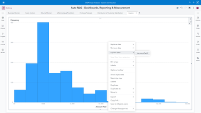
The result of this step reveals a NLG summarization of the metric's range, average, trend, related factors and the detection of outliers.

Naturally, a curious analyst would like to improve their understanding of the detected outliers. SAS provides users DIFM outlier impact insights to consume a detailed analysis.

Users simply click the Analyze Objects for Impact button, and SAS will produce an auto-generated assessment of the outlier values themselves, their correlation to related data items, and impact on the metric of interest. For example, in Image 7 below, the outliers are associated with the men's leisure product category and have a 10.75% impact on the average value of Amount Spent.

For years, analysts have been taught to use their best judgement to decide whether treating outliers is necessary and how to go about it. At SAS, we believe bringing forth more granularity to evaluating outliers is needed. For now, reflect on this question:
Are all outliers the same?
More on this after a quick introduction to anomalies...
Anomalies
Anomalies are referred to as data points which do not conform to an expected pattern of the other items in the data set. Anomalies represent a uniquely different distribution that occurs as a subset within a larger distribution. Anomaly detection refers to the problem of finding patterns in data that do not conform to expected behavior. The importance of detection is due to the fact that anomalies in data frequently translate to actionable information.
Let’s look at a few real-world examples of anomalies in martech. Marketing teams must be proactive rather than reactive, and use a variety of tools to track key metrics through paid media, digital analytic and marketing automation platforms. Anomaly detection can indicate when something has gone wrong or that an unexpected result has been achieved. Applied examples can include unexpected variances in:
- Cost per click (CPC) campaign metrics
- Clickthrough rates (CTR)
- Target audience conversion performance
- Web or landing page visits
- User engagement metrics
A straightforward example in SAS is through the usage of the Anomaly Detection data preprocessing node. For users of SAS model pipelining capabilities, the node identifies and enables analysts to decide whether to exclude/include anomalies using Support Vector Data Description (SVDD).

Briefly, the SVDD formulation identifies outliers by determining the smallest possible hypersphere (built using support vectors) that encapsulates the training data points. The SVDD then isolates those data points that lie outside the sphere that is built from the training data. It is a one-class classification technique that is useful in applications where data that belongs to one class is abundant, but data about any other class is scarce or missing. You can use SVDD to model such one-class data and subsequently use the model to perform anomaly detection. More information for users interested in this capability is available here.

After running the node, users can open the results window similar to Image 9 above to review:
- Anomaly Counts - Includes number and percentage of anomalies, observations used in training, observations with missing inputs, and total observations.
- SVDD Distance Histogram - Displays a bar chart that shows the distribution of observations using their respective SVDD distance (after scoring the train data). The distance is divided into 20 bins of equal size. Bins are color-coded to indicate whether the bars are less than or greater than the threshold that marks the boundary when identifying anomalies.
- Training Results - Displays the results of the training procedure.
- Optimization Summary — Displays a summary of the anomaly detection run itself, including the number of iterations, objective value, infeasibility, optimization status, and the degenerate indicator variable.
If we take a closer look at the SVDD Distance Histogram, analysts can get a transparent understanding of what determines an observation to be an anomaly.

Take note of the long tail to the right of this graph in Image 10. Although the purple bars are short in height, they are greater than the threshold that dictates when an observation is identified as an anomaly. Now that ten anomalies have been identified, let's take a quick look at these customers. The data used in this anomaly detection example originates from a financial services brand in the context of whether or not a customer will default on a loan (home improvement, debt consolidation, etc.). By sorting the scored data based on the calculated SVDD Distance column in descending order, we can scan the anomalies.

Recall, a SVDD model builds a minimum-radius hypersphere around the one-class training data. The hypersphere provides a compact spherical description of the training data. You can use this training data description to determine whether a new observation is similar to the training data observations. The distance from any new observation to the hypersphere center is computed and compared to the hypersphere radius. If this distance is greater than the radius, the observation is designated as an outlier. Hence, by sorting the SVDD Distance column, we arrive immediately to the culprits. In addition, SAS enables users to access and pivot to making the scored table available for exploratory visual analysis.

After selecting the Explore and Visualize button shown above in Image 12, analysts can utilize any flavor of modern visualization to improve their understanding of customer records with high SVDD scores indicating anomaly behavior. In the example below in Image 13, I am simply sharing a comparison of the amount due related to the customer's mortgage loan between high and low SVDD scores. To the right, I have added the SVDD score metric to the filter window. A simple drag will subset the data to the relevant value filter, and allow me to focus on mortgage loan due amounts that have been detected for anomalies. This example is fairly obvious where the anomalies correlate with very high values.
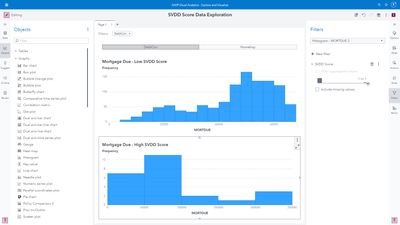
Another way to visualize and diagnose relationships between high and low SVDD scores is by taking the average across all numeric measures in a data set. In Image 14, it is clear which measures index higher and lower.

A second approach for performing anomaly detection in SAS is through Isolation Forests. Before we dive in, let's briefly summarize Forests within machine learning. A predictive model defines a relationship between input variables and a target variable. The purpose of a predictive model is to predict a target value from inputs. The FOREST procedure within SAS trains the model; that is, it creates the model by using training data in which the target values are known. The model can then be applied to observations in which the target is unknown. If the predictions fit the new data well, the model is said to generalize well. Good generalization is the primary goal for predictive tasks.
A Decision Tree is a type of predictive model that has been developed independently in the statistics and artificial intelligence communities. The FOREST procedure creates a tree recursively: The procedure chooses an input variable and uses it to create a rule to split the data into two or more subsets. The process is then repeated in each subset, and then again in each new subset, and so on until some constraint is met.
The FOREST procedure creates multiple decision trees that differ from each other in two ways: First, the training data for each tree constitute a different sample; each sample is created by sampling with replacement observations from the original training data of the forest. Second, the input variables that are considered for splitting a node are randomly selected from all available inputs. Among these randomly selected variables, the FOREST procedure chooses a single variable, which is associated the most with the target, when it forms a splitting rule.
An Isolation Forest is a specially constructed forest that is used for anomaly detection instead of target prediction. When the FOREST procedure in SAS creates an isolation forest, it outputs anomaly scores. The anomaly score is always between 0 and 1, where values closer to 1 indicate a higher chance of the observation being an anomaly.
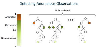
For each split in an Isolation Forest, one input variable is randomly chosen. If the variable is an interval variable, then it is split at a random value between the maximum and minimum values of the observations in that node. If the variable is a nominal variable, then each level of the variable is assigned to a random branch. By constructing the forest this way, anomalous observations are likely to have a shorter path from the root node to the leaf node than non-anomalous observations have.
Anomalous observations are less frequent than regular observations and are different from them in terms of values (they lie farther away from the regular observations in the feature space). That is why by using such random partitioning, they should be identified closer to the root of the tree (shorter average path length), with fewer splits necessary.
Isolation Forests fall under the category of unsupervised anomaly detection because they are applicable when no historical information about events of interest can be used to train the model. Staying consistent with our earlier example related to the financial services industry, let's use fraud as our anomaly analysis event focus. Unsupervised methods are used to find anomalies by locating observations within the data set that are separated from other heavily populated areas of the data set. By analyzing customers or transactions relative to each other, we’re able to spot unusual observations. These observations can potentially be indicative of fraud and, by identifying them, we are able to examine what is occurring and if it is of a fraudulent nature.

The data set for this example contains simulated mobile- based payment transactions for a variety of transactions, with 11 variables and 6,362,620 observations. The fraudulent behavior of the agents involves a misleading act for financial gain by taking control of customer accounts and trying to empty the funds by transferring to another account and then cashing out of the system.
In the heatmap example below in Image 17, a score close to 1 indicates anomalies. Scores below or very near 0.5 indicate normal observations. If all scores are close to 0.5, then the data does not seem to have clearly distinct anomalies. As we can see, this is not the case.

The assumption behind this is that fraudulent behavior can often appear as anomalous within a data set. It should be noted that just because an observation is anomalous, it doesn’t mean it is fraudulent or of interest to the user. Similarly, fraudulent behavior can be disguised to be hidden within more regular types of behavior. However, without labeled training data, unsupervised learning is a good method to use to begin to identify deviant accounts or transactions.
Moving on from fraud detection, similar analyses can surface insights related to a brand's 1st party dimensions and metrics across a variety of use cases (non-normal conversion values, spikes or dips in cart abandonment rates, etc.), as well as inform the data storytelling aspects of an analyst presentation to inspire a marketing team to consider unique strategies for customer segments that behave differently. This is the intersection where analytics meets martech. The design of segments, email campaigns, web/mobile personalization, A/B tests and ultimately customer journeys can all be influenced on detecting, understanding & taking action on unique consumer trends.

Are All Outliers & Anomalies The Same?
For years, analysts have focused on the critical decision of detecting unusual customer behavior, and then selecting to include or exclude those unique data points. But isn't it odd that we draw a line in the data sand, and classify an observation as extreme or not? This is especially important when influencing our marketing peers to take specific actions. We can do better.
Declaring an observation as extreme based on just one feature (univariate analysis) can lead to unrealistic inferences. When analysts have to decide if an individual entity is an extreme value or not, it is better to collectively consider the features that matter. A multivariate approach is a combination of unusual scores on two or more variables.
A multivariate outlier procedure available in SAS is MVOUTLIER. The procedure performs robust principal component analysis (PCA) to identify orthogonal outliers and leverage points in any numeric multivariate data set. It is especially useful for correlated high-dimensional data, because the PCA subspace serves as a robust lower-dimensional representation of the data - robust in the sense of minimizing the impact of extreme observations while estimating the covariance structure.
The MVOUTLIER procedure divides observations into four main categories in terms of their relationship to the subspace:
- A homogeneous group that is close to the center of the PCA subspace
- High-leverage observations that are close to the subspace but far from its center
- Outlying observations that are far from the subspace but close to its center after being projected onto it
- Observations that are both far from the subspace and far from its center after being projected onto it

A customer observation could be unusual for multiple reasons and can be categorized as an outlier, leverage, and outlier + leverage. Leverage points and orthogonal outliers are differentiated by their respective scores and orthogonal distances. These distances tell us how far an observation is from the center of the ellipse defined by normal observations (displayed in the lower left section of the graph in Image 19). The robust score distance is a measure of the distance between an observation belonging to the k-dimensional PCA subspace and the origin of that subspace. The orthogonal distance measures the deviation — i.e. lack of fit — of an observation from the k-dimensional PCA subspace.
Thus, leverage points are characterized by a high robust score distance, while orthogonal outliers are characterized by a high orthogonal distance. Likewise, outlier + leverage points are differentiated by high values of both orthogonal and robust score distances, and frequently (but not always) showcase influence on the trend within the data. A point is considered influential if its exclusion causes major changes in the analysis use case. In Image 19 above, we showcase the ability to segment customers with varying forms of outlier assessment.

Often the lower-dimensional representation of the data that you obtain from robust PCA is used for some other multivariate analysis, such as cluster analysis (unsupervised segmentation) shown in Image 20. An initial identification of outliers and leverage points from robust PCA can better inform the subsequent analysis and design of actionable segments. In other words, those same segment definitions used in campaign management and marketing automation tools. You might be asking is it worth putting in the work? Just like sports, the more an athlete prepares, the better their performance. It's no different when applying data science to martech.

Users of SAS MVOUTLIER can apply it naturally to any situation that involves numeric multivariate data in which anomaly detection is desired. The use cases for anomaly detection are expanding across the entire martech industry. We look forward to what the future brings in our development process – as we enable technology users to access all of the most recent SAS analytical developments. Learn more about how SAS can be applied for customer analytics, journey personalization and integrated marketing here.
- Mark as Read
- Mark as New
- Bookmark
- Permalink
- Report Inappropriate Content
Good overview !
Anomaly detection can also be done using autoencoders.
An autoencoder is a type of artificial neural network (ANN) used to learn efficient codings of unlabeled data (unsupervised learning)
Or, if you are still using SAS 9, use Robust statistics for outlier detection.
Like here :
Detecting outliers in SAS: Part 3: Multivariate location and scatter
By Rick Wicklin on The DO Loop February 2, 2012
https://blogs.sas.com/content/iml/2012/02/02/detecting-outliers-in-sas-part-3-multivariate-location-...
Cheers,
Koen
- Mark as Read
- Mark as New
- Bookmark
- Permalink
- Report Inappropriate Content
Hi,
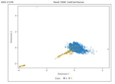
I also like to use t-sne (or t stochastic neighbour embedding), which can highlight anomalies (and other patterns). In the example below using credit card fraud data from Kaggle, I've reduced the dimensionality from 27 down to 2 and then overlaid the fraud flags (the fraud flags played no part in building the model - only for display). Many of the frauds seem quite anomalous from the rest of the group, so might help to identify new fraud typologies. If you get a chance try it out on some data and see what you get. Good luck. Colin
Available on demand!
Missed SAS Innovate Las Vegas? Watch all the action for free! View the keynotes, general sessions and 22 breakouts on demand.
Free course: Data Literacy Essentials
Data Literacy is for all, even absolute beginners. Jump on board with this free e-learning and boost your career prospects.
