- Home
- /
- SAS Communities Library
- /
- SAS VA and process control charts
- RSS Feed
- Mark as New
- Mark as Read
- Bookmark
- Subscribe
- Printer Friendly Page
- Report Inappropriate Content
SAS VA and process control charts
- Article History
- RSS Feed
- Mark as New
- Mark as Read
- Bookmark
- Subscribe
- Printer Friendly Page
- Report Inappropriate Content
(UPDATE: a more complete and detailed paper can be found at
https://communities.sas.com/t5/SAS-Communities-Library/Building-dynamic-process-control-charts-with-...)
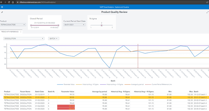
Recently two pharmaceutical companies asked me to produce a particular control diagram of the production process with a high degree of dynamism. The requirement is to provide high flexibility in the selection of production batches and time periods. In addition, they need to calculate the central line and control limits over a consolidated historical period and compare these limits with new values and central line after some changes have been made to the production process.
This was what I proposed them:

Starting with a simple dataset providing batch characteristics and the observed parameter values, the analyst can select:
- which product and value to plot;
- which product batches to include/exclude, the overall period and how to split the overall period in two parts: historical and current;
- The number of sigma to use for control limits ranges.
Note that:
- the “current period vertical reference line” is dynamic and created with a Custom Graph;
- the “average by period” line takes into account the two different periods so that this line is almost never a straight one.
As an example of the calculations, this is the Lower Control Limit definition:

They were thrilled (more than I expected) so I made some research to find which is the background of such analysis, and I found this paper with some theoretical foundation:
https://www.mwsug.org/proceedings/2018/HS/MWSUG-2018-HS-71.pdf
"In healthcare, the purpose of statistical process control (SPC) is often to quantify improvements and identify unintended consequences resulting from an intentional change in an environment, policy, treatment protocol, or decision-support tool.
Unlike in manufacturing, process change - rather than stability - is commonly sought, and interventions might be frequent and staggered over time. … We describe approaches to defining a baseline period, and extending its center line prospectively to apply special cause variation tests against it."
Even more interesting :
"The Health Care Data Guide: Learning from Data for Improvement (Provost and Murray 2011) provides guidance to healthcare institutions to develop and operationalize the knowledge and tools needed for “Learning from Variation in Data” through the use of SPC. The section titled “Establishing and Revising Limits for Shewhart Charts” highlights several nuances operational leaders and their statisticians should understand and consider in analyzing the impact of intervention. These include defining a baseline period; “ghosting” data points in the baseline period that are considered special cause variation; and detecting improvements after freezing and extending an initial mean, or center line."
My next “curiosity” was to understand how far I might go in trying to replicate the solid and exhaustive procedures like proc Shewhart from SAS QC and her "blazing fast sister" proc SPC in SAS Visual Statistics.
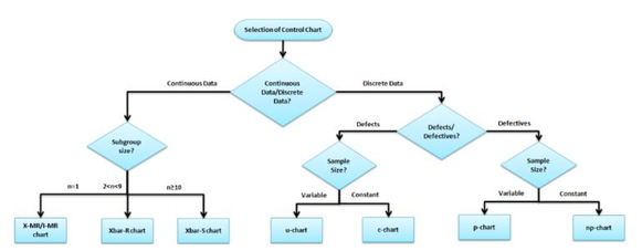
The objective is trying to replicate in Visual Analytics as much a possible of the control chart taxonomy (as proc Shewhart and proc SPC do):

( source https://sixsigmastudyguide.com/control-charts-study-guide/)
The good news is that both proc Shewhart and proc SPC export the full detail of the results, so it is possible to process in batch thousand on control charts, mark then few which are not in control or violates “western electric rules” and plot them using SAS Visual Analytics:

That’s fine, but I wanted to know if I could calculate on the fly some of these chart types in VA, leaving the user free to specify the time range periods and to select the batches to consider.
Many control charts require to calculate the average of an average/range/standard deviation. This involves calculating an aggregation over an aggregated variable which is not possible in SAS Viya 3.5.
There are three possible ways each with pros and cons:
- Use the AggregateTable operator
- Load on VA data which have been already aggregated at subgroup level (i.e. data with Average/Standard Deviation/Range already calculated at the subgroup level) and then let VA to calculate the final average and the control limits values.
- Load detail data on VA, let VA calculating the basic statistics at subgroup level and then pass them to a Data Driven Content object to make the final calculations and display the graphs
I experimented the first two options with good results and I hope to post a new article on this soon.
So it seems that there is ground to use SAS Visual Analytics as a flexible companion of powerful SPC and Shewhart standard procedures.
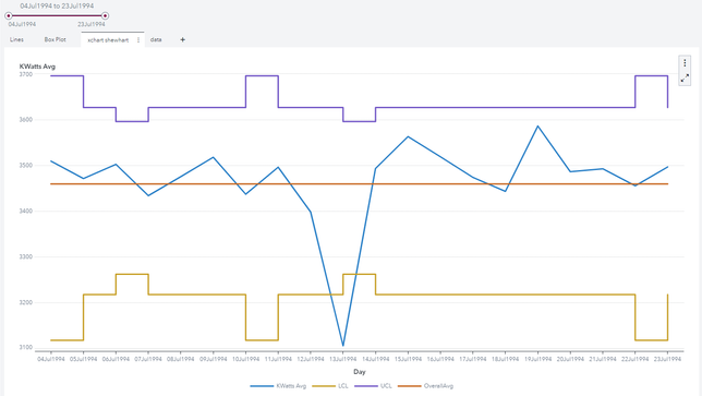
Final remark: If you are making control chart with different subgroup size and you need to extend the standard line chart object, you might consider building a Custom Graph to combine a "Line Chart" with a "Step Plot". The result is similar to standard control chart graphs:

Available on demand!
Missed SAS Innovate Las Vegas? Watch all the action for free! View the keynotes, general sessions and 22 breakouts on demand.
Free course: Data Literacy Essentials
Data Literacy is for all, even absolute beginners. Jump on board with this free e-learning and boost your career prospects.

