- Home
- /
- SAS Communities Library
- /
- Building dynamic process control charts with SAS ® Visual Analytics in...
- RSS Feed
- Mark as New
- Mark as Read
- Bookmark
- Subscribe
- Printer Friendly Page
- Report Inappropriate Content
Building dynamic process control charts with SAS ® Visual Analytics in Pharma and Healthcare
- Article History
- RSS Feed
- Mark as New
- Mark as Read
- Bookmark
- Subscribe
- Printer Friendly Page
- Report Inappropriate Content
Abstract
Shewhart control chart are used as a monitoring tool in pharmaceutical manufacturing process to reduce the reject ratio and promote the continuous improvement of products. As an example, control charts are used in Pharma for Product Quality Review (PQR) which is a clear requirement of all cGMP guidelines and is a powerful tool for measuring and optimizing not only product quality but also process efficiency. In Healthcare, the purpose of statistical process control (SPC) is often to quantify improvements and identify unintended consequences resulting from an intentional change in an environment, policy, treatment protocol.
In this paper we demonstrate how SAS® Visual Analytics can be used to build dynamic and interactive XS control chart. The analyst can perform actions such as the following: defining a baseline period and extending its center line, UCL and LCL prospectively; removing any subgroup from baseline calculations; selecting control chart which violates limits and western electric rules; adjusting the sigma multiplier. The same methodology can be applied to build other Shewhart control charts.
This approach enhances and complements a traditional batch approach based on SAS/QC® by providing a high degree of interactivity and flexibility on the data visualization phase.
Attached above are:
- A short demo video.
- A pdf version of the paper including all the details of the calculated items in SAS Visual Analytics plus an appendix including a program to generate proc Shewhart chart and compare it with SAS Base calculations.
Introduction
This article illustrates how to use with SAS Visual Analytics to create one of the most popular control charts in Statistical Process Control (SPC). Before going on with the illustration of the control chart, some fundamental concepts are briefly introduced.
Statistical Process Control is a method of quality control which employs statistical methods to measure, monitor, and control a process.
Control charts are ones of the primary techniques of statistical process control. A control chart is a graphical display of quality characteristics that have been measured versus the sample number or production time. The control chart was invented by Walter Shewhart at Bell labs in 1920.
The control chart is hence a graph used to study how process changes over time. A control chart usually has a central line for the (estimated) average of the process measure, an upper line for upper control limit, and lower line for the lower control limit. The control limits are usually ±3 (estimated) standard deviation of the measure from the centerline.
We can say a process is out-of-control if any point in the control chart is out of control limits or having abnormal patterns of variability. Teams must identify special causes and try to eliminate to achieve a stable process (Hessing, Ted. 2022).
The aim of this paper is describing a real-world use case requirement for a flexible and interactive control chart which arise in the Product Quality Review of a Pharma production process and how this requirement can be accomplished with SAS Visual Analytics.
The paper is organized as follows: the first section illustrates the requirements from the real-world use case and it shows how such dynamic chart can be realized with SAS Visual Analytics. The second section introduces motivations and benefits for this flexibility requirements by providing literature references. The third section shows how the use case can be generalized to produce a chart which respects the specification of the XS chart of SAS QC proc SHEWHART. The fourth section discusses how much this approach can be extended to the complete taxonomy of control charts. The fifth section advocates the benefits of implementing control charts with SAS Visual Analytics by itself or by enhancing and complementing the traditional approach based on proc Shewhart in SAS QC or proc SPC in SAS Visual Statistics.
Real world use case requirement
Recently, two different Pharma companies have expressed the need to provide their analysts with a highly dynamic control chart. The requirement is to provide the user with high flexibility in selecting batches and time periods. The user should hence be allowed to define the date splitting the time period in two parts: one historical and one current. The report should hence calculate central line and control limits on the historical period values and compare them with current period values and current central line.
Before illustrating in the next section the motivations and benefits for this flexibility requirements, we illustrate how all these requirements were accomplished and how the user can interact with the analysis.
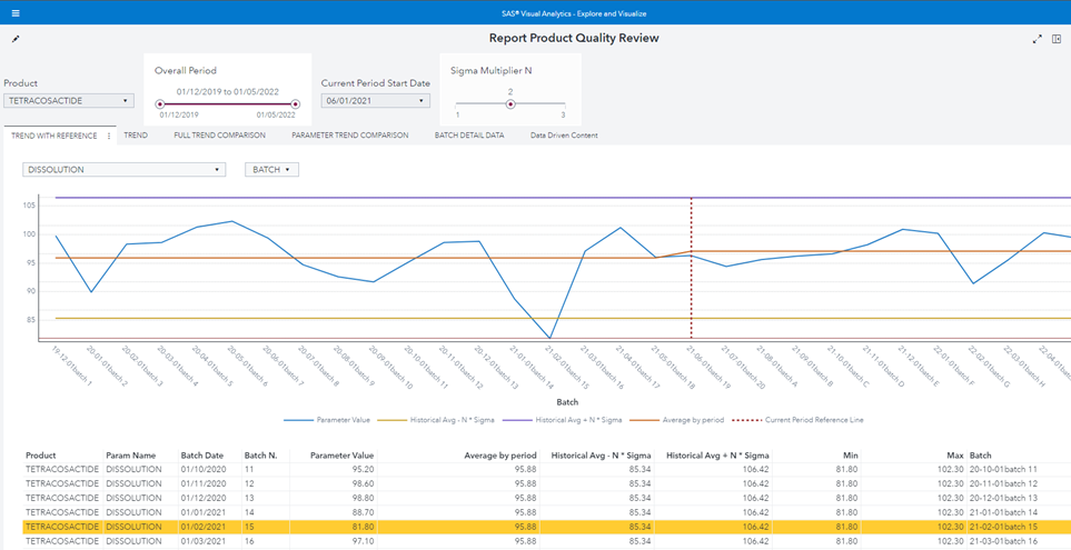
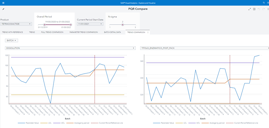
Figure 1 Product Quality Review control chart shows the SAS Visual Analytics report which fulfills all requirements mentioned above:
Figure 1 Product Quality Review control chart
The user analyst can select from left to right and from top to bottom:
- The product.
- The overall period.
- How to split the overall time period in two part, historical and current, by selecting the “Current Period Start Date”.
- The number of sigma multiplier N to use for the control limits definition.
- The measure (parameter) to plot.
- Which batches to include/exclude (also by selecting batch properties).
Note that:
- The “current period” red dotted reference line is dynamic and added with a Custom Graph by using a Line chart and a Needle chart.
- The “Average by period” line calculates the average in two different periods so it is not a straight line.
- The batch n. 15 violates the Lower Control Limit.
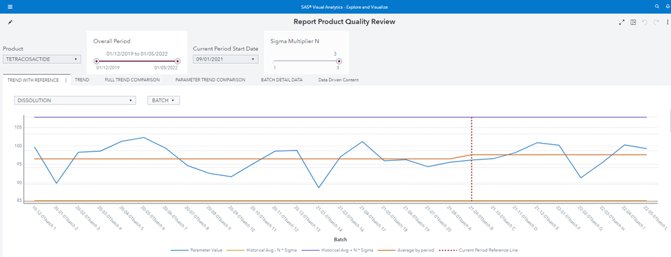
As an example of the required flexibility, the user can:
- Remove the batch n. 15 because s/he knows there was an exceptional issue in production.
- Change The “current start date” to 1 Sep 2021.
- Augment the sigma multiplier N to 3.
The chart immediately reflects user inputs:
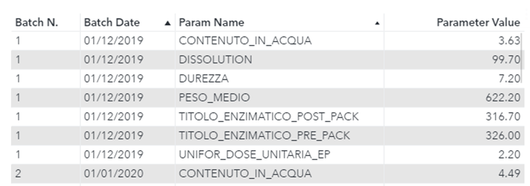
Basic input table data structure
Table 1 depicts the required basic data structure:
|
FIELD |
DESCRIPTION |
|
Batch N |
Batch identifier |
|
Batch Date |
Usually batch production date |
|
Param Name |
Measure Name |
|
Param Value |
Measure Value |
Table 1 - Basic data structure
Figure 2 shows an example of the basic input table. The table can have any number of additional classifiers which may be used to filter batches, periods and parameters:
Figure 2 – Basic Input Table example
Motivations for the analysis and reference literature
Motivations of the aforementioned flexibility are explained by R. Jones and L. Liu in “Leveraging SHEWHART Procedure Options to Monitor and Evaluate Improvements in Healthcare” (2018). Authors state:
In healthcare, the purpose of statistical process control (SPC) is often to quantify improvements and identify unintended consequences resulting from an intentional change in an environment, policy, treatment protocol, or decision-support tool […]
Unlike in manufacturing, process change - rather than stability - is commonly sought, and interventions might be frequent and staggered over time.
(Jones and Liu 2018, 1).
Hence not only process stability but also effects in intentional changes can be monitored with control charts. In the same article we read:
The Health Care Data Guide: Learning from Data for Improvement (Provost and Murray 2011) provides guidance to healthcare institutions to develop and operationalize the knowledge and tools needed for “Learning from Variation in Data” through the use of SPC. The section titled “Establishing and Revising Limits for Shewhart Charts” highlights several nuances operational leaders and their statisticians should understand and consider in analyzing the impact of intervention. These include defining a baseline period; “ghosting” data points in the baseline period that are considered special cause variation; and detecting improvements after freezing and extending an initial mean, or center line (Jones and Liu 2018, 1).
Control charts are not used only as a passive tool to monitor stability, but also as an active and dynamic tool:
The main purpose for defining the center line and control limits for the baseline period is the generation of a comparison period against which improvements or unintended consequences of the intervention can be detected and statistically quantified (Jones and Liu 2018, 1).
A more generic approach
The question then arises: how far can we go in replicating with SAS Visual Analytics the solid and exhaustive procedures like proc Shewhart in SAS QC and proc SPC in SAS Visual Statistics?
The goal is to replicate in SAS Visual Analytics as much as possible of the control chart taxonomy:
Figure 7 - Process Control Chart Taxonomy
We start with XS chart (Xbar-S chart), given its popularity among the control charts.
Implementing Proc Shewhart XS chart in SAS Visual Analytics
We now show how to replicate the XS Chart of proc Shewhart which corresponds to the Xbar-S chart (Hessing, Ted 2022) in the taxonomy above. The general case of N samples (subgroups) with different sizes is considered and the proc Shewhart diagram is replicated with SAS Visual Analytics.
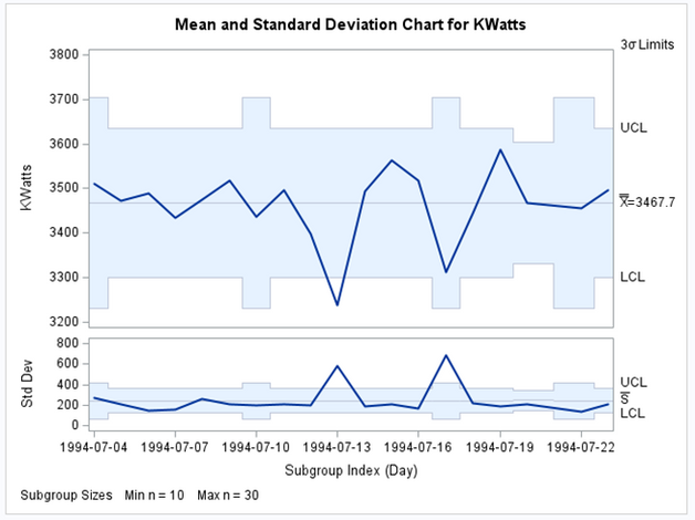
In the following Image, we have the XS chart built with SAS/QC proc Shewhart. The X chart is at the top and plots the average value of each subgroup. The S chart is at the bottom and plots the standard deviation of each subgroup.
Figure 8 - XS chart with SAS QC proc Shewhart
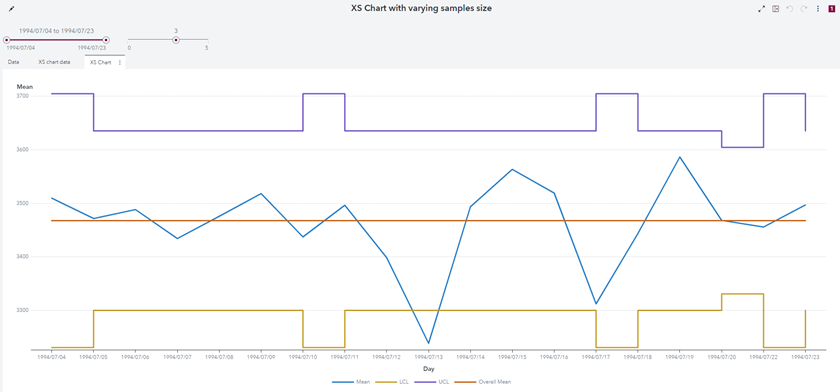
Below is the corresponding graph on SAS Visual Analytic. Note that only the X chart is represented (but the S chart may be done similarly):
Figure 9 - X Chart with SAS Visual Analytics
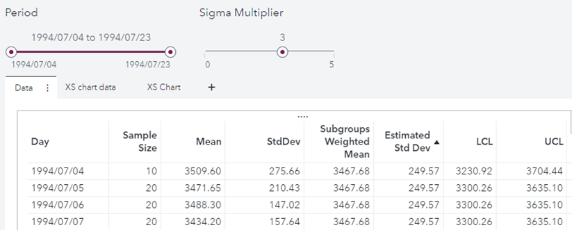
Below is a listing of the obtained data:
The values are identical to the results obtained with proc Shewhart:
Attached above is a pdf version of the paper includes all the details of the calculated items in SAS Visual Analytics plus an appendix including a program to generate proc Shewhart chart and compare it with SAS Base calculations.
Control char taxonomy coverage
This is the list of charts included in the taxonomy of Figure 7 and available in proc Shewhart. They can all be implemented with SAS Visual Analytics.
|
Proc Shewhart chart type |
Replicable in SAS Visual Anaytics |
Notes |
|
IR chart |
Yes* |
With limitations in filtering |
|
M chart |
Yes |
Using median, estimated std, and control chart constants |
|
MR chart |
Yes |
Using median, ranges, estimated std, and control chart constants |
|
XR chart |
Yes |
Using mean, ranges, estimated std, and control chart constants |
|
XS chart |
Yes |
As shown in the paper |
|
U chart |
Yes |
|
|
C chart |
Yes |
|
|
P chart |
Yes |
|
|
NP chart |
Yes |
|
Complementing and enhancing batch processing
The approach described in this paper can be implemented with SAS Visual Analytics alone, but it can benefit, complement and enhance the results obtained with proc Shewhart and proc SPC.
Both proc Shewhart and proc SPC can:
- Export the full detail of the results.
- Export summary tables with statistics on limits violation.
- Test for presence of special patters as “western electric rules”.
As an example of these functionalities, let us consider the default output from PROC SPC is an exception summary table. For each process, the table shows the number of subgroups that were analyzed and the number of subgroup summary statistics that fell outside the control limits of each chart (SAS Institute Inc. 2022):
It is possible to process thousand on control charts in batch mode, mark the ones which are not in control or violates “western electric rules”. By loading the corresponding data on SAS Visual Analytics we can plot the violating charts and analyze them in further detail with the flexible approach described above.
The approach lends itself to being used both:
- Tactically when it is useful to insert a control chart as an enrichment of a report focused on a broader topic.
- Strategically when it comes to adding an interactive display of exceptions to massive batch processes production of control charts.
In the second scenario, the goal is not to replace such procedures but to leverage all the feature and functions of SAS Visual Analytics about data visualization, report authoring, user profiled sharing and collaboration.
With a minimal training on SAS Visual Analytics and no coding, the analyst can produce his/her views, for example comparing the control chart of two parameters:
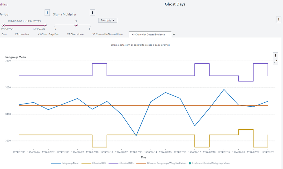
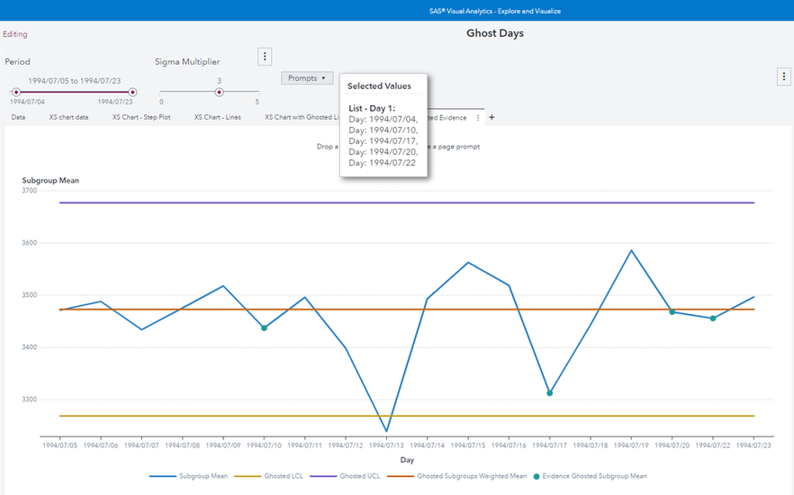
As a further example, with a multivalue parameter is possible to implement “ghosting data” as defined in the paper of Roderick Jones and Lynn Liu:
I start from this view:
Now I put in the ghost list all the days where the sample size is different from the most frequent sample size (which is 20). Ghosted values are the green dots. Since all not ghosted samples have equal size, UCL and LCL become straight lines.
The possibilities are limitless and are typical of a self-service analytics tool.
Conclusion
In this paper we describe a real world requirement for a dynamic and flexible control chart to be used in the Product Quality Review Process of a Pharma company. We show how this can be easily implemented in SAS Visual Analytics. We provide motivations and benefits of this approach found in Healthcare literature. We then generalize the real word use case to the XS chart of SAS/QC proc Shewhart. We provide hints on how this approach can be applied to build the complete taxonomy of control charts. Lastly, we discuss how this approach can complement and enhance a SAS batch process production of control charts.
References
Provost, L. P. and Murray, S. K. 2011. The Health Care Data Guide: Learning from Data for Improvement. San Francisco, CA: John Wiley & Sons
SAS Institute Inc. 2020. SAS/QC® 15.2 User’s Guide. Cary, NC: SAS Institute Inc.
SAS Institute Inc. 2022. SAS® Visual Statistics: Procedures. Cary, NC: SAS Institute Inc
Jones, R. and Liu, L. 2018. “Leveraging SHEWHART Procedure Options to Monitor and Evaluate Improvements in Healthcare. “ Proceedings of the Midwest SAS User Group 2018 Conference, Indianapolis, IN. Available at https://www.mwsug.org/proceedings/2018/HS/MWSUG-2018-HS-71.pdf.
Hessing, Ted. 2022. “Control Charts Study Guide.” Accessed January 3, 2023. Available at https://sixsigmastudyguide.com/control-charts-study-guide.
Available on demand!
Missed SAS Innovate Las Vegas? Watch all the action for free! View the keynotes, general sessions and 22 breakouts on demand.
Free course: Data Literacy Essentials
Data Literacy is for all, even absolute beginners. Jump on board with this free e-learning and boost your career prospects.
