- Home
- /
- Programming
- /
- Graphics
- /
- Re: Stacked vbar seglabel not displaying
- RSS Feed
- Mark Topic as New
- Mark Topic as Read
- Float this Topic for Current User
- Bookmark
- Subscribe
- Mute
- Printer Friendly Page
- Mark as New
- Bookmark
- Subscribe
- Mute
- RSS Feed
- Permalink
- Report Inappropriate Content
Hello,
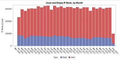
I am trying to make a simple stacked bar chart using a single variable with 2 types, and then I would like segment labels for both segments of the stacked bar chart. I am unable to get the data labels to show up for both segments. If I add "datalabel" I just get the sum of the whole column, and otherwise it is blank.
My code for creating the variable and the sgplot are below, as well as the output as I am seeing it. My log doesn't have any errors. Thanks in advance!
data ip_stacked_beds;
set monthly;
IP_Beds = IP_used;
Type = 'Used ';
output;
IP_Beds = IP_empty;
Type = 'Empty';
output;
run;
ods graphics / width=800px height=400px;
proc sgplot data=ip_stacked_beds;
title 'Used and Empty IP Beds, by Month';
format date_num nldateymm.;
vbar date_num / response=IP_Beds group=Type groupdisplay=stack
barwidth=0.9 nooutline seglabel seglabelattrs=(size=6pt);
xaxis type=discrete display=(nolabel);
yaxis grid label='IP Beds (Count)';
run;
Accepted Solutions
- Mark as New
- Bookmark
- Subscribe
- Mute
- RSS Feed
- Permalink
- Report Inappropriate Content
Best practice is to provide example data in the form of a data step that can recreate the problem.
I am pretty sure that what is happening is that the length of the segment labels is too long to fit inside the bar and the default Seglabelfitpolicy=thin is supressing them. Try adding SEGLABELFITPOLICY=NONE.
Or provide more space for the graph to allow wider bars or a smaller font to display the text. You may also consider a format like Best5. or Best4. for the response variable with the SEGLABELFORMAT= option to reduce the characters that may be displayed.
- Mark as New
- Bookmark
- Subscribe
- Mute
- RSS Feed
- Permalink
- Report Inappropriate Content
Here's an example:
Sample 55866: Use the SEGLABEL option to label bar segments in a bar chart
https://support.sas.com/kb/55/866.html
Or with a butterfly plot:
Sample 69820: Using the SGPLOT procedure to create a butterfly plot with text
https://support.sas.com/kb/69/820.html
BR, Koen
- Mark as New
- Bookmark
- Subscribe
- Mute
- RSS Feed
- Permalink
- Report Inappropriate Content
Thanks for your response. Unfortunately that seglabel code is not working. No labels are added when I include that command.
- Mark as New
- Bookmark
- Subscribe
- Mute
- RSS Feed
- Permalink
- Report Inappropriate Content
What's your SAS version?
Submit
%PUT &=sysvlong;to find out.
The SEGLABEL option is available as from SAS 9.4 TS1M2.
Earlier options include using a VLINE statement with data labels or annotation.
You need to also use SEGLABELATTRS option in order for the SEGLABEL option to be honored in SGPLOT.
BR, Koen
- Mark as New
- Bookmark
- Subscribe
- Mute
- RSS Feed
- Permalink
- Report Inappropriate Content
Best practice is to provide example data in the form of a data step that can recreate the problem.
I am pretty sure that what is happening is that the length of the segment labels is too long to fit inside the bar and the default Seglabelfitpolicy=thin is supressing them. Try adding SEGLABELFITPOLICY=NONE.
Or provide more space for the graph to allow wider bars or a smaller font to display the text. You may also consider a format like Best5. or Best4. for the response variable with the SEGLABELFORMAT= option to reduce the characters that may be displayed.
- Mark as New
- Bookmark
- Subscribe
- Mute
- RSS Feed
- Permalink
- Report Inappropriate Content
Thank you, yes this worked! The bars were not wide enough.
- Mark as New
- Bookmark
- Subscribe
- Mute
- RSS Feed
- Permalink
- Report Inappropriate Content
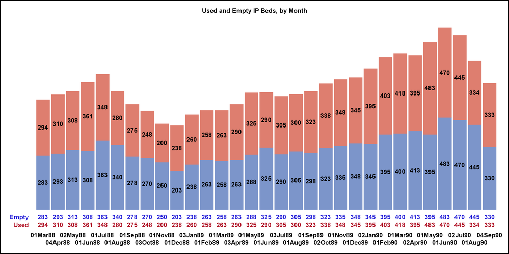
No matter how wide you make a vertical bar chart, for some data sets there will be segments that are too short to fit a segment label. An always dependable alternative, or a complement if you willing to use both segment labels and the alternative, is an X axis table. If you color code the axis table as done here, the labels of its rows can serve as substitute for a legend. The axis table sits at the bottom of bars, making the eye travel from segment to identification shorter than looking for a legend. The axis table can support any number of segments in the stack.
Of course the advantage for segment labels is sitting right inside the segments, WHEN the segment is tall enough.
The example above shows both alternatives. Either alternative can be omitted, but the axis table is dependable for ANY data set. The example uses fake data, but for the same date range.
To turn off the segment labels, omit the SEGLABEL and SEGLABELFORMAT options.
To turn off the X axis table, omit the XAXISTABLE statement, omit the NOAUTOLEGEND option, and include a KEYLEGEND statement, for which I recommend:
keylegend / title='' /* Suppress the title.
  Your graph recipient will be able to guess what it is. */
  noborder /* a border on a legend has no value */
  location=outside position=bottom
  autooutline /* Prevent outlines on color swatches,
    to match the VBAR NOOUTLINE option.
    When this option is omitted,
    the color swatches are always outlined.*/
  fillheight=6pt /* I adjusted this
    to approximately match the legend value height.
    I usually use one point less than the value height. */
  fillaspect=golden;
See the attached full code for the example. Its use of an custom ODS style to control the graph's text attributes is optional. If omitted, the results are unpredictable. Look elsewhere for my other work on visual data insights, communication-effective data visualization, and other charts, plots, and graphs used for visual communication of data.
SAS Innovate 2025: Save the Date
SAS Innovate 2025 is scheduled for May 6-9 in Orlando, FL. Sign up to be first to learn about the agenda and registration!
Learn how use the CAT functions in SAS to join values from multiple variables into a single value.
Find more tutorials on the SAS Users YouTube channel.
SAS Training: Just a Click Away
Ready to level-up your skills? Choose your own adventure.


