- Home
- /
- Programming
- /
- Graphics
- /
- Re: How can I simplify/beautify a busy stacked bar chart comparing two...
- RSS Feed
- Mark Topic as New
- Mark Topic as Read
- Float this Topic for Current User
- Bookmark
- Subscribe
- Mute
- Printer Friendly Page
- Mark as New
- Bookmark
- Subscribe
- Mute
- RSS Feed
- Permalink
- Report Inappropriate Content
Hello all,
I need to produce a graph comparing time-to-failure between two groups within yearly cohorts over a 20-year period. That's necessarily a lot of data. I will be presenting these data in other ways, but to begin, I must present them as a whole.
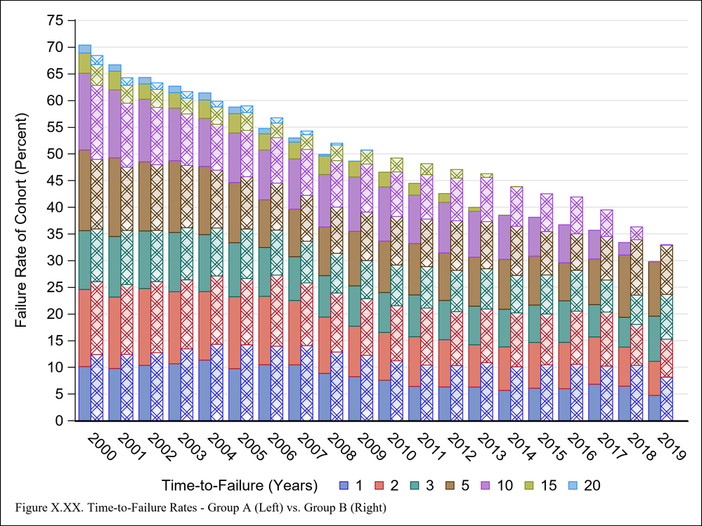
The attached graph shows two groups for each yearly cohort but it is difficult to distinguish between the group A (left) and group B (right). I have attempted to do this by adding a gradient and transparency, but perhaps there is a better way. Any suggestions?
Additionally, at present there is no way to distinguish between Group A (left) and Group B (right) aside from the footnote. Is there a way for me to somehow label the left (solid) vs. right (hatched) groups other than doubling the list of values in the legend? For example, a supplementary legend in the top-right corner that states: Solid = Group A / Hatched = Group B?
Maybe I shouldn't be using VBAR for this type of graph? If so, what other graph option would work better?
Thanks for your time!
ods graphics / reset
		height=6.5in imagename="FigureZ" imagefmt=PNG ATTRPRIORITY=NONE;
	Footnote justify=left height=1.2 font="Times New Roman" "Figure X.XX. Time-to-Failure Rates - Group A (Left) vs. Group B (Right)";
	Title;

	proc sgplot data=Failure noborder nocycleattrs;

	vbar Cohort/
		response=GroupA
		group=TTF
		grouporder=ascending
		groupdisplay=stack
		barwidth=0.4
		name="GroupA"
		legendlabel="GroupA"
		discreteoffset=-0.4;

	vbar Cohort/
		response=GroupB
		group=TTF
		grouporder=ascending
		groupdisplay=stack
		barwidth=0.4
		name="GroupB"
		legendlabel="GroupB"
		fillattrs=(transparency=0.9)
		filltype=gradient
		fillpattern
			fillpatternattrs=(pattern=x4);

	keylegend "GroupA"
		/ title="Time-to-Failure (Years)" Titleattrs=(size=12) Valueattrs=(size=12) location=outside position=bottom noborder;

	xaxis  Valueattrs=(size=12) discreteorder=data display=(nolabel noticks);
	yaxis Valueattrs=(size=12) Labelattrs=(size=12) grid values=(0 to 75 by 5) label="Failure Rate of Cohort (Percent)";
run;Accepted Solutions
- Mark as New
- Bookmark
- Subscribe
- Mute
- RSS Feed
- Permalink
- Report Inappropriate Content
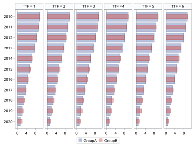
I would like to use Medal Graph:
Sochi Medal Graphs - Graphically Speaking (sas.com)
/*
https://blogs.sas.com/content/graphicallyspeaking/2014/02/12/sochi-medal-graphs/
*/
data Failure;
  call streaminit(123);
  retain GroupA GroupB 10;
  do Cohort = 2010 to 2020;

    do TTF = 1,2,3,4,5,6;
      GroupA + (-rand("uniform",0,.25));
      GroupB + (-rand("uniform",0,.25));
      output;
    end;

  end;
run;

proc sgpanel data=Failure noautolegend;
  panelby TTF / layout=panel rows=1 onepanel sort=data  spacing=5;
  hbar Cohort / response=GroupA  nostatlabel transparency=0.5 name='a';
  hbar Cohort / response=GroupB  nostatlabel transparency=0.5 barwidth=0.4 name='b';
  keylegend 'a' 'b';
  rowaxis discreteorder=data display=(nolabel) fitpolicy=none;
  colaxis integer display=(nolabel);
  run;
- Mark as New
- Bookmark
- Subscribe
- Mute
- RSS Feed
- Permalink
- Report Inappropriate Content
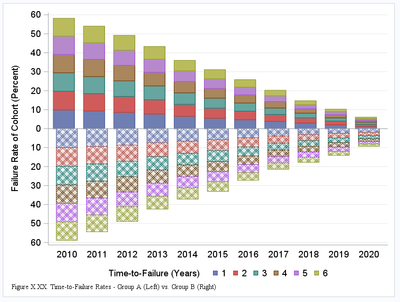
Maybe something like:
data Failure2;
  set Failure;
  GroupB  = - GroupB;
run;


ods graphics / reset
		height=6.5in imagename="FigureZ" imagefmt=PNG ATTRPRIORITY=NONE;
	Footnote justify=left height=1.2 font="Times New Roman" "Figure X.XX. Time-to-Failure Rates - Group A (Left) vs. Group B (Right)";
	Title;

	proc sgplot data=Failure2 noborder nocycleattrs;

	vbar Cohort/
		response=GroupA
		group=TTF
		grouporder=ascending
		groupdisplay=stack
		barwidth=0.7
		name="GroupA"
		legendlabel="GroupA"
		discreteoffset=-0.1
    ;

	vbar Cohort/
		response=GroupB
		group=TTF
		grouporder=ascending
		groupdisplay=stack
		barwidth=0.7
		name="GroupB"
		legendlabel="GroupB"
		fillattrs=(transparency=0.9)
		filltype=gradient
		fillpattern
			fillpatternattrs=(pattern=x4);

	keylegend "GroupA"
		/ title="Time-to-Failure (Years)" Titleattrs=(size=12) Valueattrs=(size=12) location=outside position=bottom noborder;

	xaxis  Valueattrs=(size=12) discreteorder=data display=(nolabel noticks);
	yaxis Valueattrs=(size=12) Labelattrs=(size=12) grid
    values=(-60 to 60 by 5)
    valuesdisplay=(
    %macro loop(s,e,b,f=ABS);
      %local i;
      %do i = &s. %to &e. %by &b.;
        "%sysfunc(&f.(&i.))"
      %end;
    %mend;
    %loop(-60,60,5)
    )

    label="Failure Rate of Cohort (Percent)";
	run;
I had to generate data myself:
data Failure;
  call streaminit(123);
  retain GroupA GroupB 10;
  do Cohort = 2010 to 2020;

    do TTF = 1,2,3,4,5,6;
      GroupA + (-rand("uniform",0,.25));
      GroupB + (-rand("uniform",0,.25));
      output;
    end;

  end;
run;
Result:
Bart
Polish SAS Users Group: www.polsug.com and communities.sas.com/polsug
"SAS Packages: the way to share" at SGF2020 Proceedings (the latest version), GitHub Repository, and YouTube Video.
Hands-on-Workshop: "Share your code with SAS Packages"
"My First SAS Package: A How-To" at SGF2021 Proceedings
SAS Ballot Ideas: one: SPF in SAS, two, and three
SAS Documentation
- Mark as New
- Bookmark
- Subscribe
- Mute
- RSS Feed
- Permalink
- Report Inappropriate Content
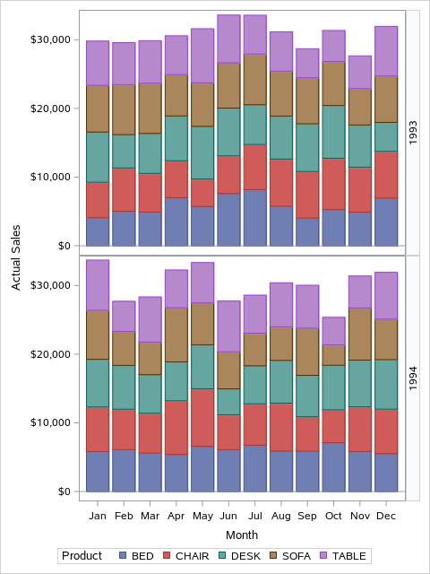
One alternative would be to transpose your data so that your GroupA and GroupB responses are folded together with a GROUP column containing the values "GroupA" and "GroupB". Then, you could something like the following with PROC SGPANEL:
proc sgpanel data=sashelp.prdsale;
panelby year / layout=rowlattice novarname;
vbar month / response=actual group=product;
run;- Mark as New
- Bookmark
- Subscribe
- Mute
- RSS Feed
- Permalink
- Report Inappropriate Content
Thanks @yabwon and @DanH_sas for your suggestions!
However, I am hoping to find a strategy that plots each group side-by-side so that each yearly cohort can be compared without referring to any values on the Y-axis.
For example, my existing vbar plots show that for cohorts 2000 - 2004, group A (left) had a higher Time-to-Failure than group B (right), but this trend reversed for cohorts 2005 onward (group B had a higher TTF) than group A).
- Mark as New
- Bookmark
- Subscribe
- Mute
- RSS Feed
- Permalink
- Report Inappropriate Content
Given that goal, I would use a two overlaid VLINEs instead of overlayed VBARs, and I would drop the TTF group. That way, you can clearly see the transition you described. Just use the default STAT of SUM. I would also use the MARKERS option so you will see the markers at each year.
- Mark as New
- Bookmark
- Subscribe
- Mute
- RSS Feed
- Permalink
- Report Inappropriate Content
Since the segments starting position don't always align, this graph doesn't really do that.
I'd consider some variation on a slope graph with small multiples possibly.
Slope Graph
https://www.storytellingwithdata.com/blog/2020/7/27/what-is-a-slopegraph
Small Multiples
https://kieranhealy.org/blog/archives/2020/03/27/a-covid-small-multiple/
- Mark as New
- Bookmark
- Subscribe
- Mute
- RSS Feed
- Permalink
- Report Inappropriate Content
I would like to use Medal Graph:
Sochi Medal Graphs - Graphically Speaking (sas.com)
/*
https://blogs.sas.com/content/graphicallyspeaking/2014/02/12/sochi-medal-graphs/
*/
data Failure;
  call streaminit(123);
  retain GroupA GroupB 10;
  do Cohort = 2010 to 2020;

    do TTF = 1,2,3,4,5,6;
      GroupA + (-rand("uniform",0,.25));
      GroupB + (-rand("uniform",0,.25));
      output;
    end;

  end;
run;

proc sgpanel data=Failure noautolegend;
  panelby TTF / layout=panel rows=1 onepanel sort=data  spacing=5;
  hbar Cohort / response=GroupA  nostatlabel transparency=0.5 name='a';
  hbar Cohort / response=GroupB  nostatlabel transparency=0.5 barwidth=0.4 name='b';
  keylegend 'a' 'b';
  rowaxis discreteorder=data display=(nolabel) fitpolicy=none;
  colaxis integer display=(nolabel);
  run;
- Mark as New
- Bookmark
- Subscribe
- Mute
- RSS Feed
- Permalink
- Report Inappropriate Content
I generally hate stacked bar charts. It's really hard to see trends in the size of each section of a bar, unless the differences are huge.
I think it would help to think about "what is the purpose of this plot" or, "what is the story I want this graph to tell." It's often easier for a graph to tell one story clearly, rather than try to make it tell multiple stories.
I agree with Dan, if your goal is to compare failure rates, I would use a line plot.
When I think time-to-failure, I think Kaplan-Meier survival plot. What if you made a paneled survival plot? Each plot could show the survival curve for your two groups. And there could be one plot per year. I guess 20 plots in a panel might be a bit much...
April 27 – 30 | Gaylord Texan | Grapevine, Texas
Registration is open
Walk in ready to learn. Walk out ready to deliver. This is the data and AI conference you can't afford to miss.
Register now and lock in 2025 pricing—just $495!
Learn how use the CAT functions in SAS to join values from multiple variables into a single value.
Find more tutorials on the SAS Users YouTube channel.
SAS Training: Just a Click Away
Ready to level-up your skills? Choose your own adventure.


